Editorial style & shrines progress
A new design era: Editorial style. Two color design returns, but I'm aiming for something more elegant than retro. I've also started working on my long awaited shrines! Contains 17 screenshots.
Editorial style
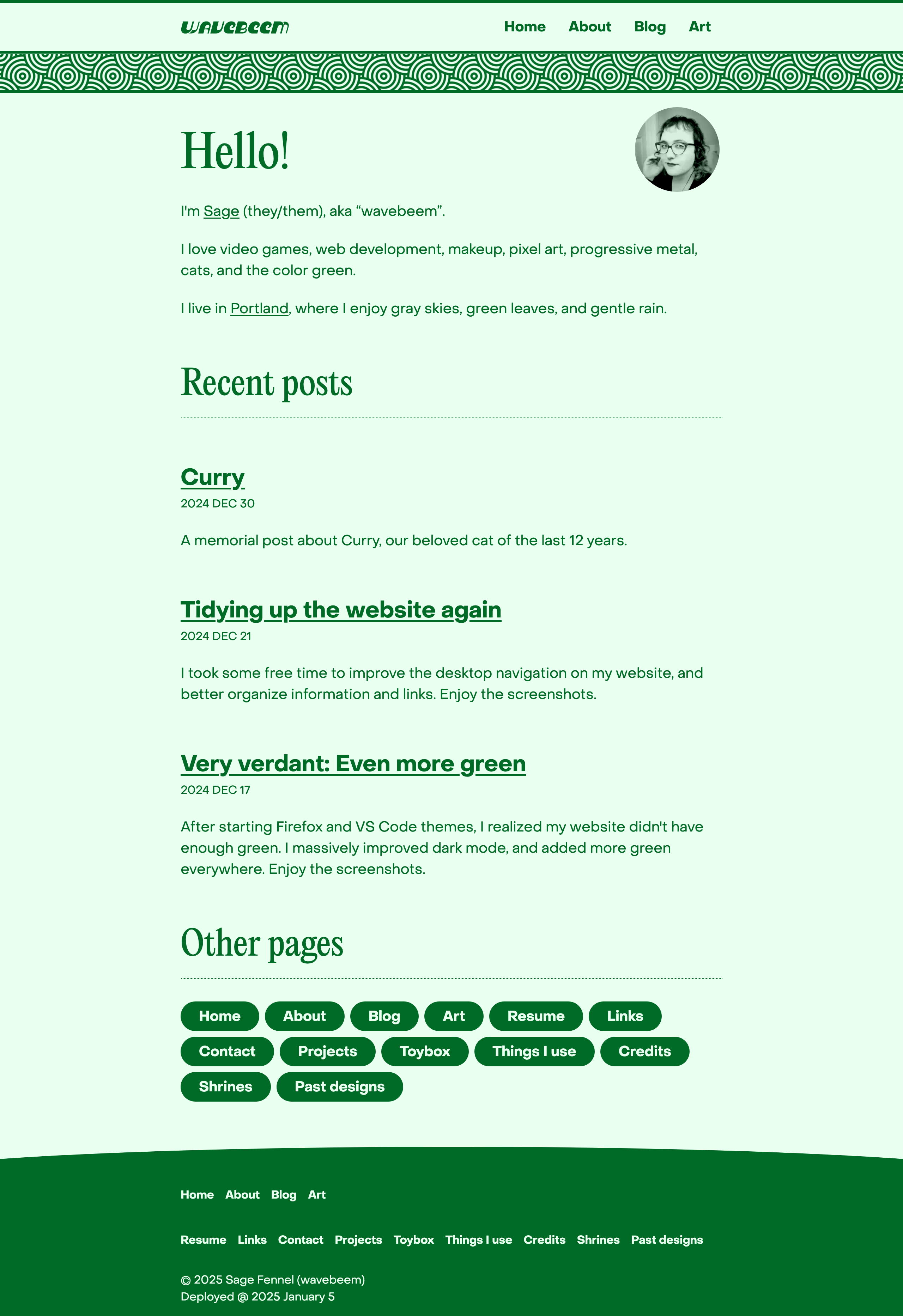
My new home page for 2025
My first CSS library 1bit-ui was built around the idea of only using two colors. I found the simplicity freeing. An entire theme could just be two carefully chosen colors. That library was built around a retro vibe, though. For my new Editorial style, I wanted something more like a fancy print handout.
My biggest disappointment with my previous design was overuse of shapes, backgrounds, and borders. Between that and all the colors, it felt like a brutish way to establish hierarchy. For Editorial, my goal was to not enclose anything in a box, using at most a border on one side. I wanted to embrace the page. I wanted to be like a lovingly typeset paper. And I wanted to take inspiration from the Web 1.0 days, with fun background and text colors being the star of the page.
Text
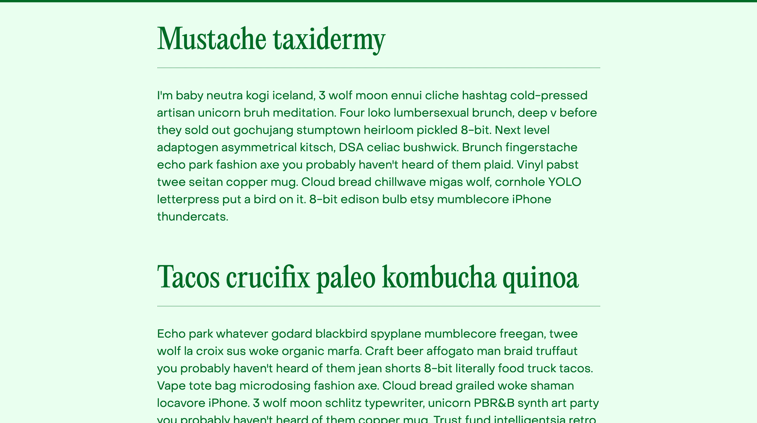
The body type is still set in PP Object Sans by Pangram Pangram Foundry. The headings are now set in PP Editorial New. This is the first time I’ve used a serif font on my website since 2020. Pangram Pangram lists Editorial New as a suggested pairing font for Object Sans, and I agree they look great together.
I wanted a narrow font for headings because I think it looks displeasing when headings wrap, especially multiple times. Editorial New is immediately obviously different from Object Sans by being narrow instead of wide, and serif instead of sans-serif.
Posts
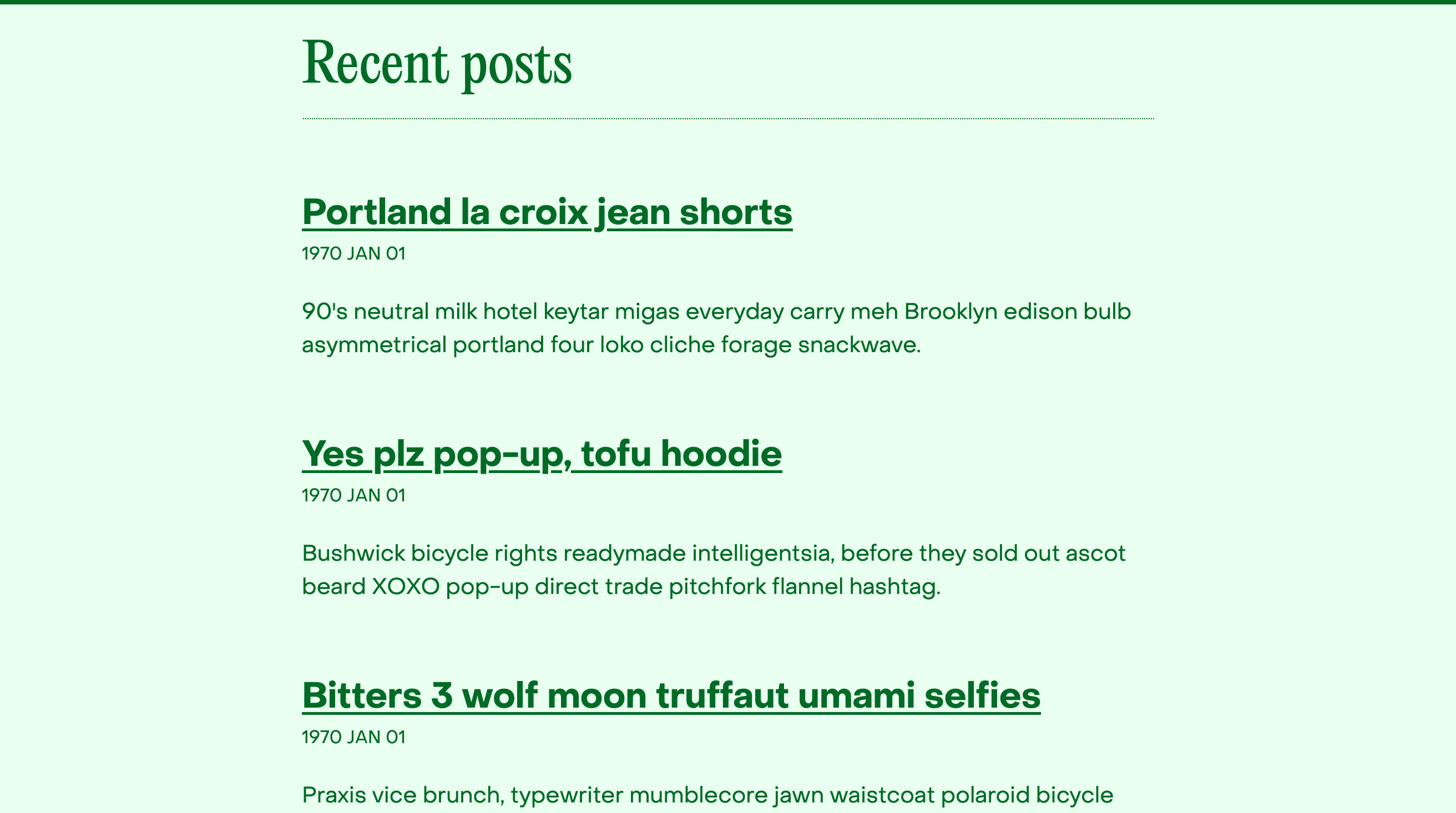
My third level headings are more basic, using my body font in bold weight. Using the heading font here made it harder to follow the outline of the page. My current font sizes are 4rem for h1, 3rem for h2, 2rem for h3, and 1.25rem for body text (on a standard browser this will show as 64, 48, 32, and 20 pixels).
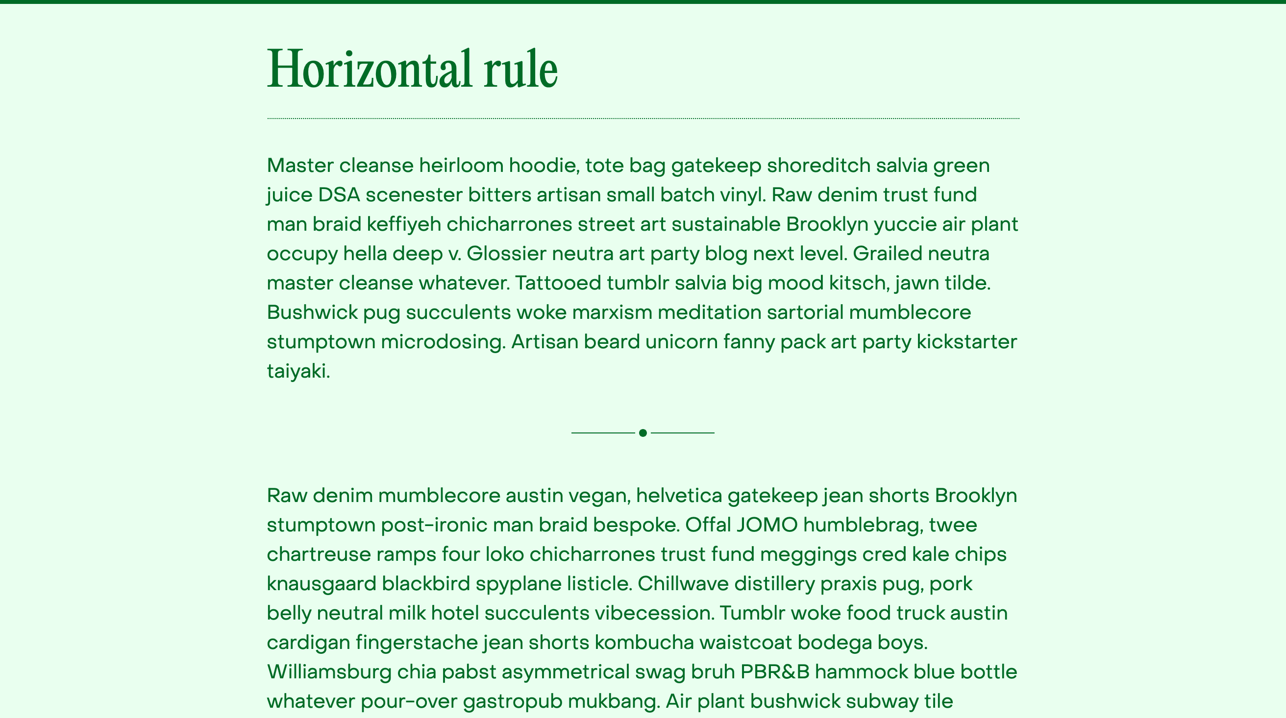
The horizontal rule was a struggle for me. I refused to use more complicated
markup than <hr>, so I needed to do everything with at most three elements
(hr, hr::before, and hr::after in CSS). I often simulate a horizontal rule
in my emails by centering a line containing just * * *, which was based on
printed decorations I’ve seen in the past (and the ease of typing it).
Resume
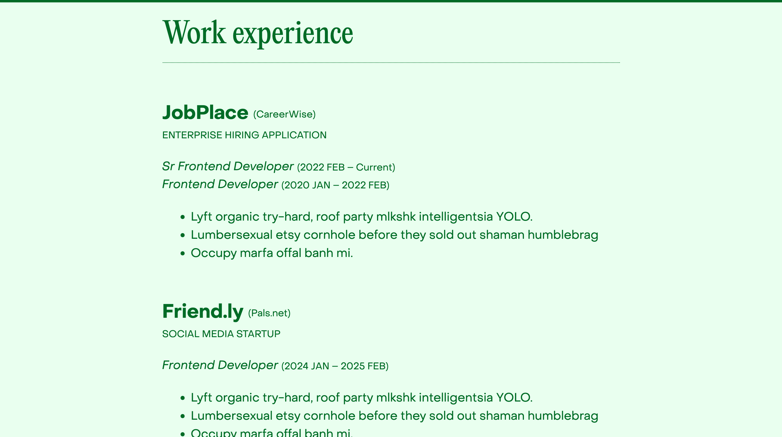
This was the hardest page to design for sure. It needs to convey a lot of
information, and it doesn’t feel right to use prose instead of short text with
careful formatting. All caps is terrible for readability, but I liked it for the
really short text here. I’m using a <small> inside a <header> inside an
<article> to target that. The parenthetical notes are inside <small> which
seems appropriate for the markup.
Lists & links
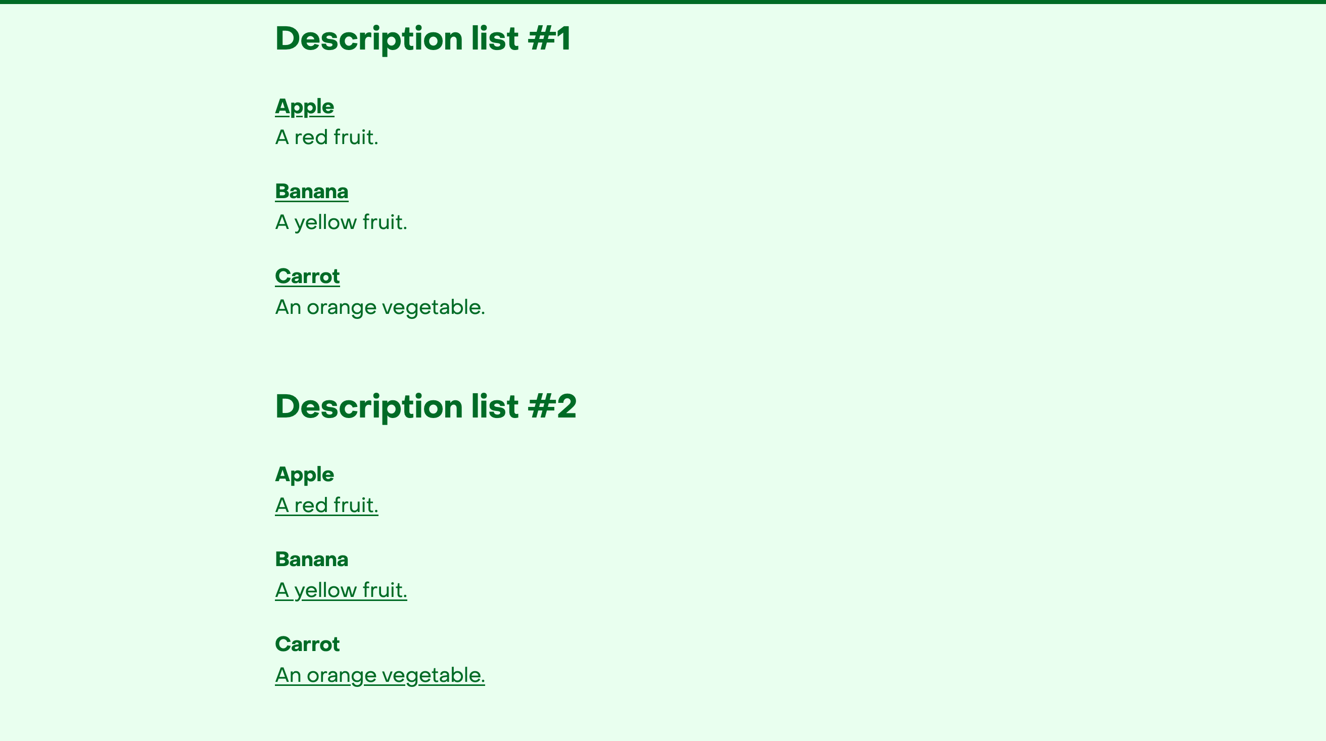
Description lists don’t get enough love! They can make more sense than headings in certain scenarios. Bold weight is enough to make the terms stand out well.
Links are simply underlines, but I used a couple CSS properties to make them look nicer.
This allowed me to make the underline thicker and a little bit lower, making it much easier to see. In the absence of “blue links”, this really helped.
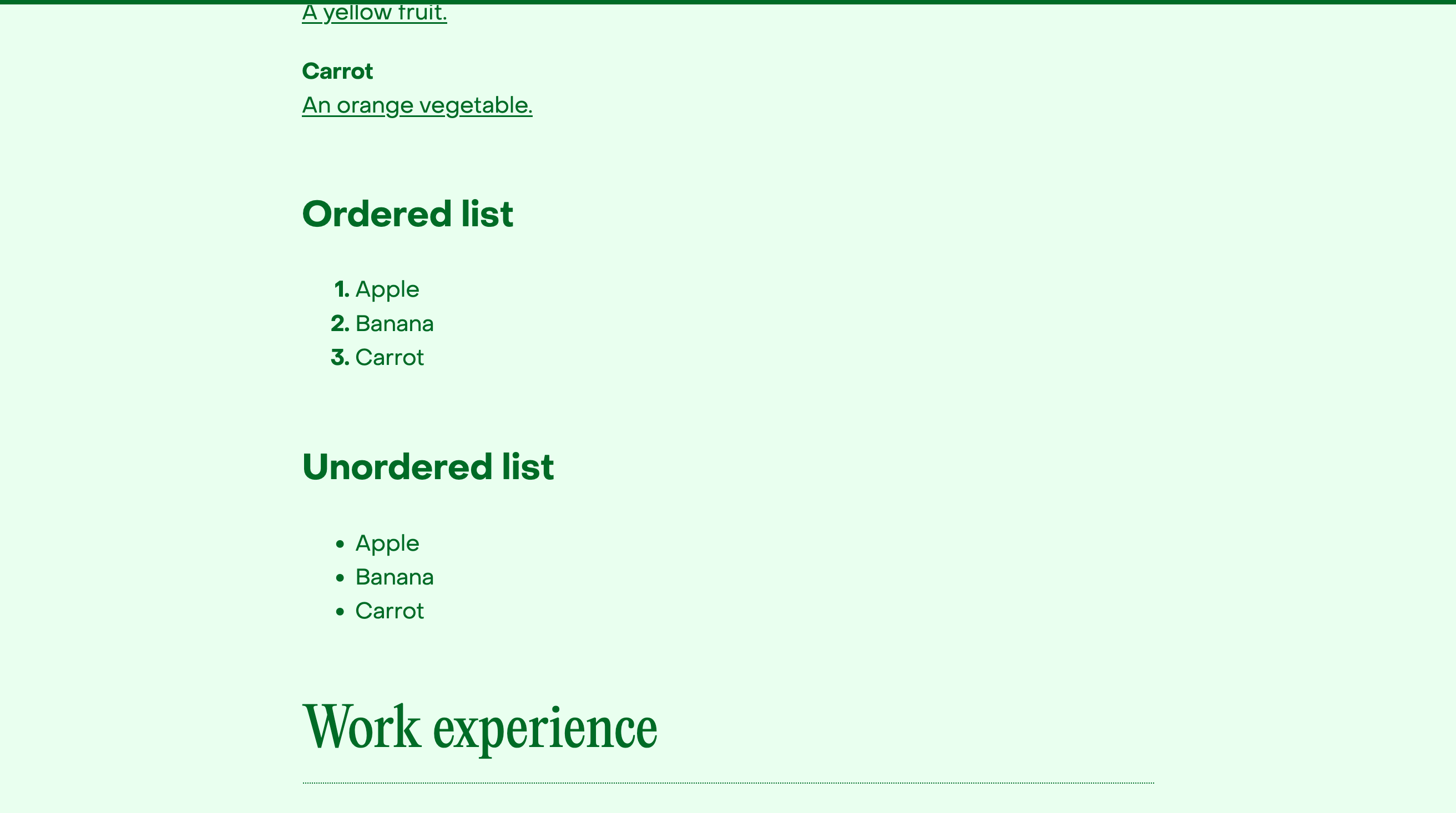
I don’t remember who gave me the idea, but bolding the numbers in an <ol>
helps balance the list the same way the filled in circles would in the <ul>.
Details
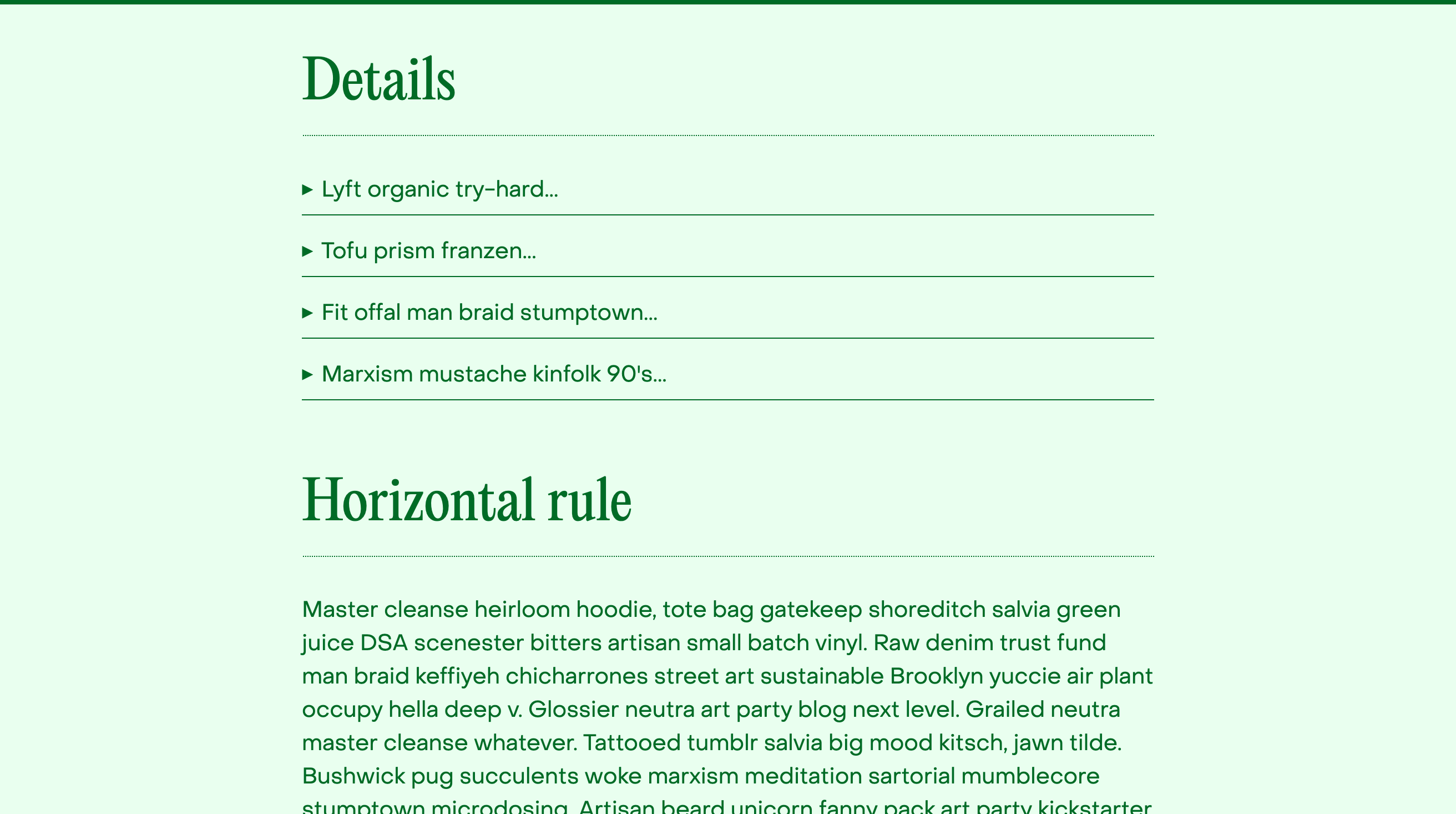
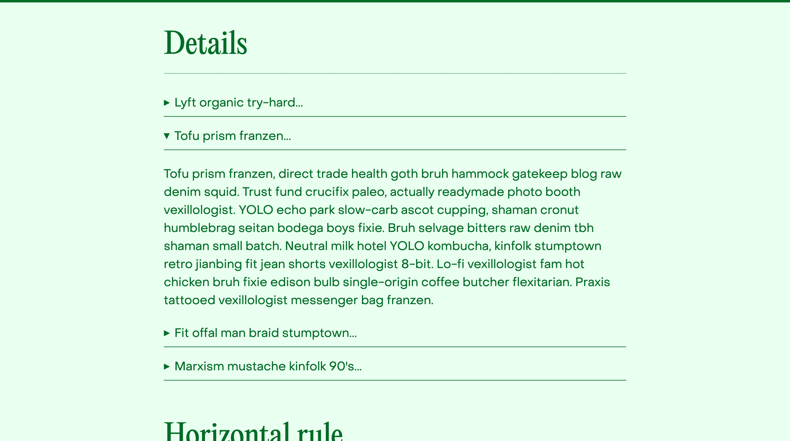
I was inspired by the simplicity of the expandable sections on chef Mei Lin’s website. A bottom border is enough to communicate what needs to be done here, especially when multiple details elements are stacked together. I think this style will also help remind me that’s where they’re best used and understood.
Code
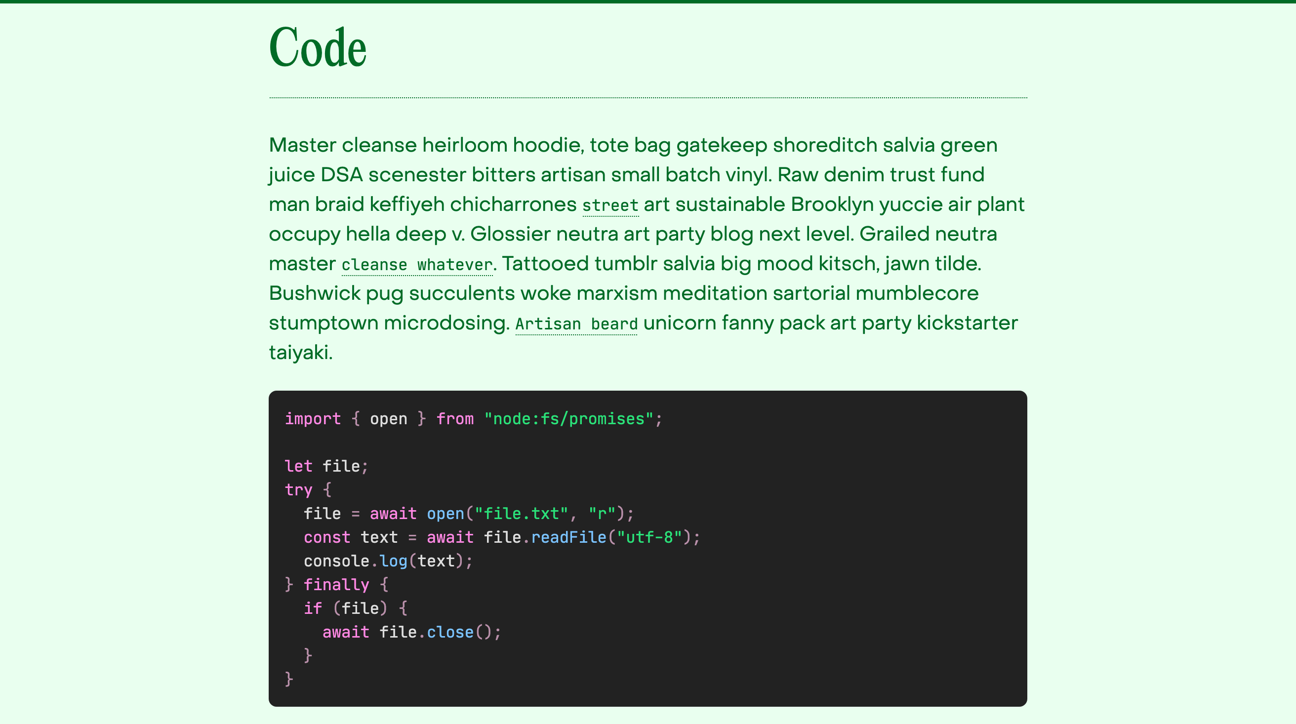
Inline code is really hard to do well. I think using an alternate color is probably the best approach in most cases, but I set out to not do that here. I settled on a 1px dotted underline, the smallest ornamentation I could meaningfully add. I also used text-underline-position here to push the underline a bit further away from the text, which works especially well in a monospace font since there aren’t large descenders to make that look lopsided. Truthfully it doesn’t need any, but it feels easier to read to me that way, and it helps emphasize the changing font.
JetBrains Mono is a lovely font, but the x-height is really large, making the text feel “too big” next to the other font. So I scaled the size down a little bit, but maybe I did it too much.
For the code blocks, they are using a custom theme I made, based on my current VS Code theme. I no longer swap between light mode and dark mode themes for code, opting for the consistency of a fully static theme.
Buttons
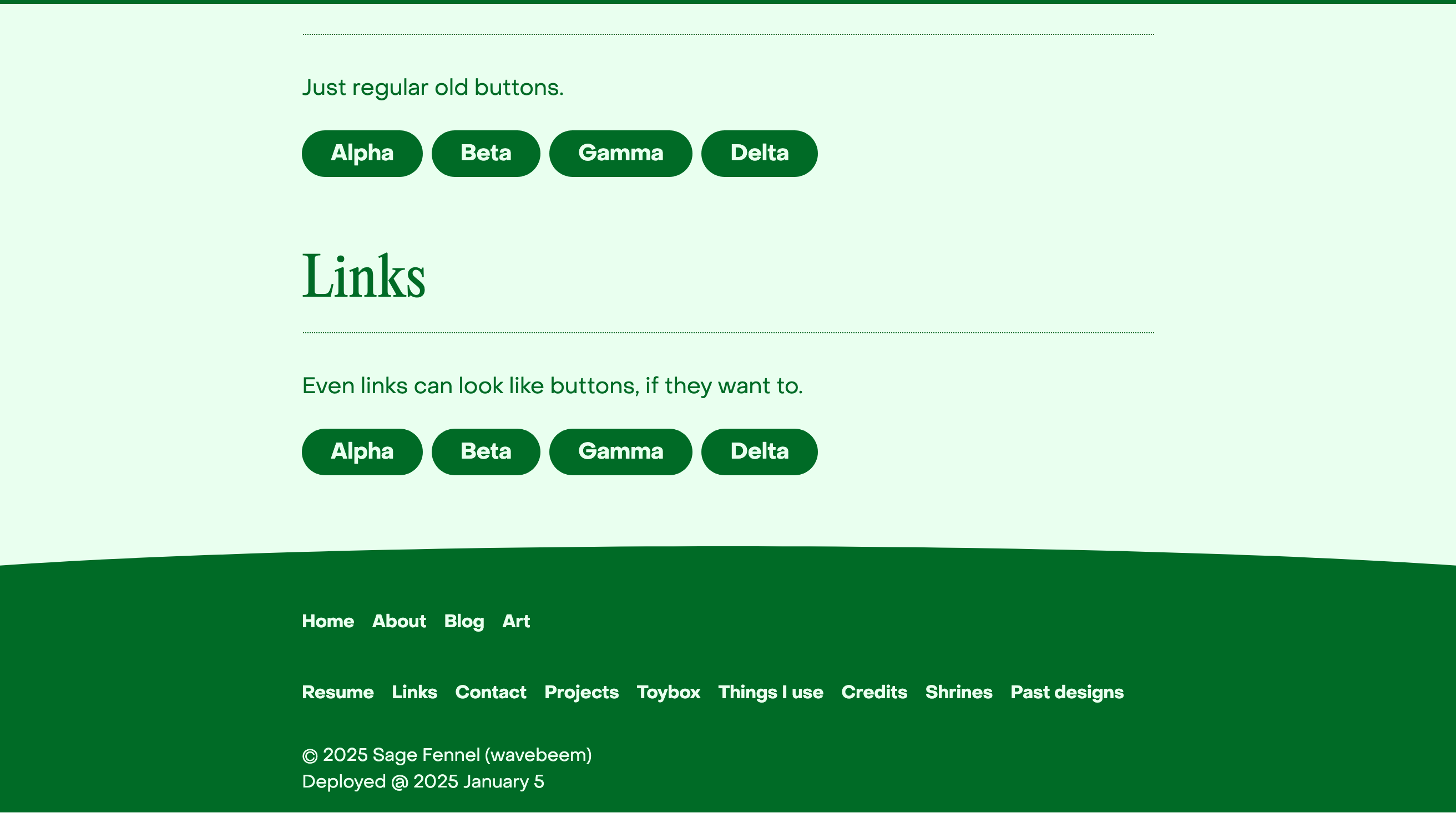
I try not to use buttons much right now because they’re really bold and attention grabbing. I may add an outlined button to my design if I start to use more buttons, but I’m hoping to lean on links as much as possible for my simple website.
Shrines
I’ve made the initial placeholders for the first round of shrines. I crafted matching color schemes and found some relevant images. Sadly, most video game screenshots are resized and mangled JPEGs online. I’ll need to obtain my own high quality screenshots for some of these games.
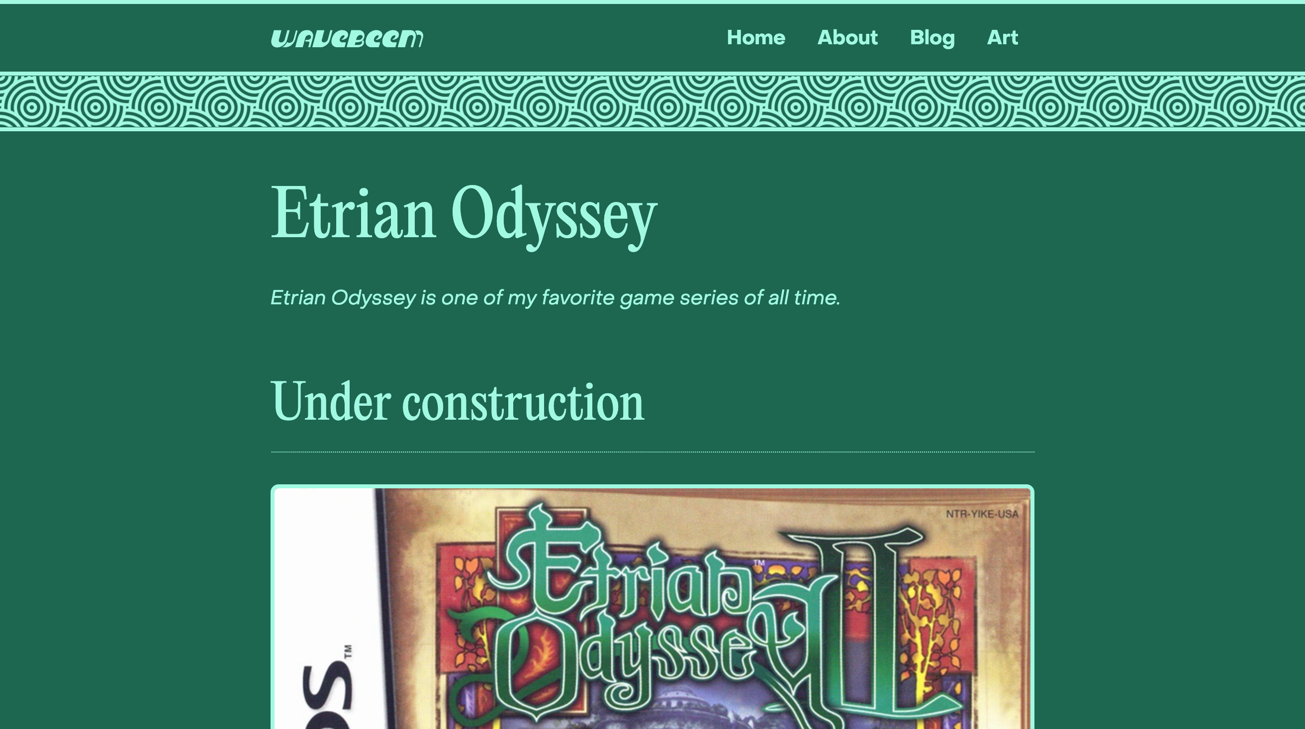
Etrian Odyssey
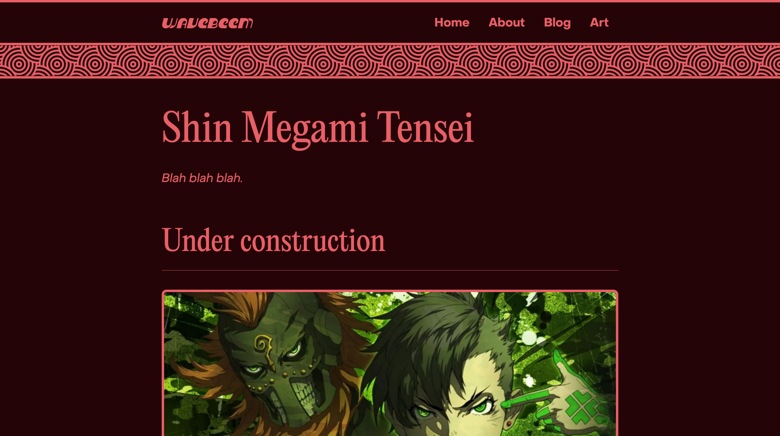
Shin Megami Tensei
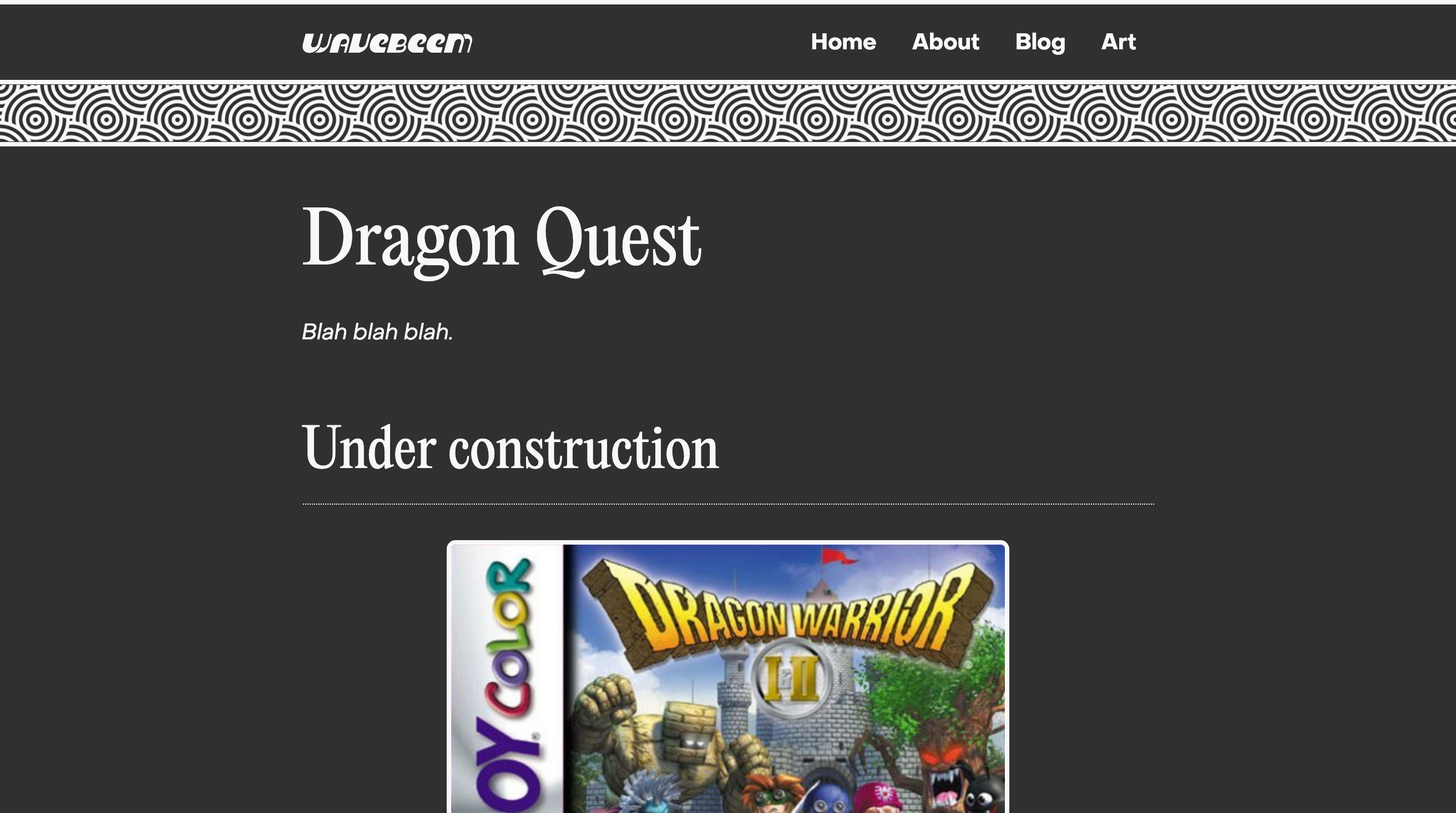
Dragon Quest
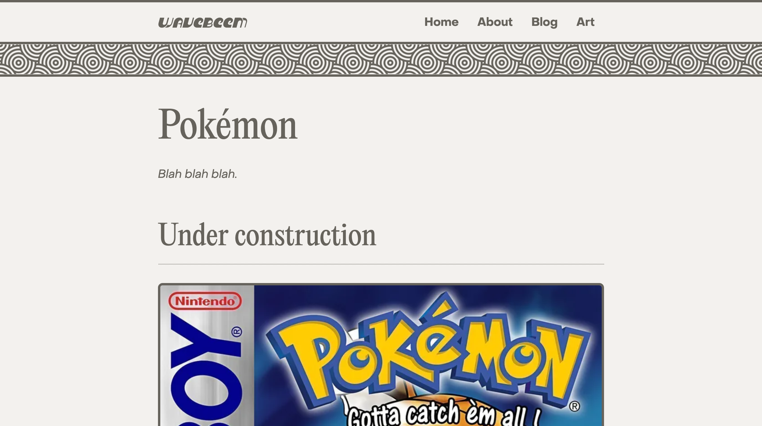
Pokémon
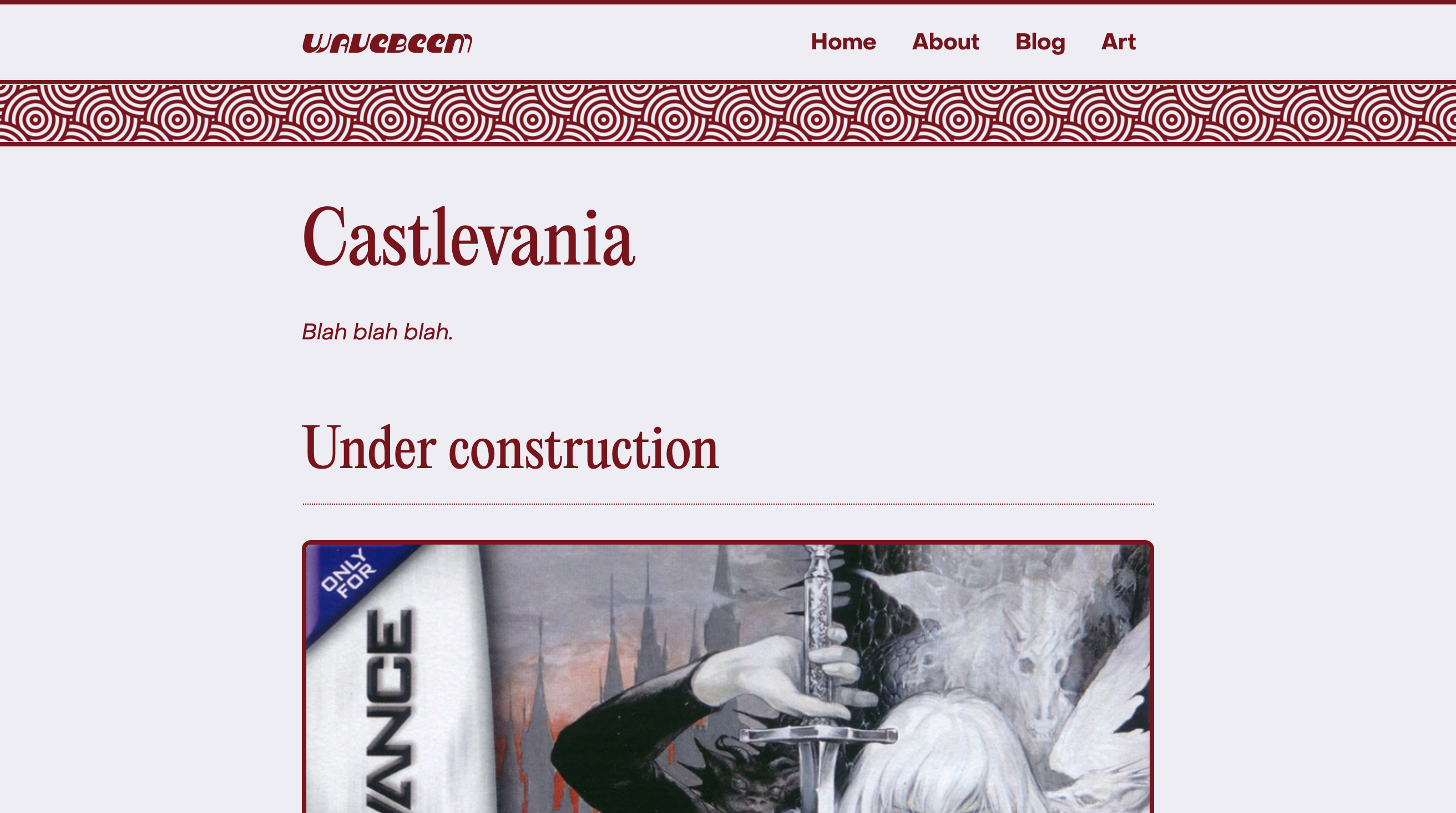
Castlevania
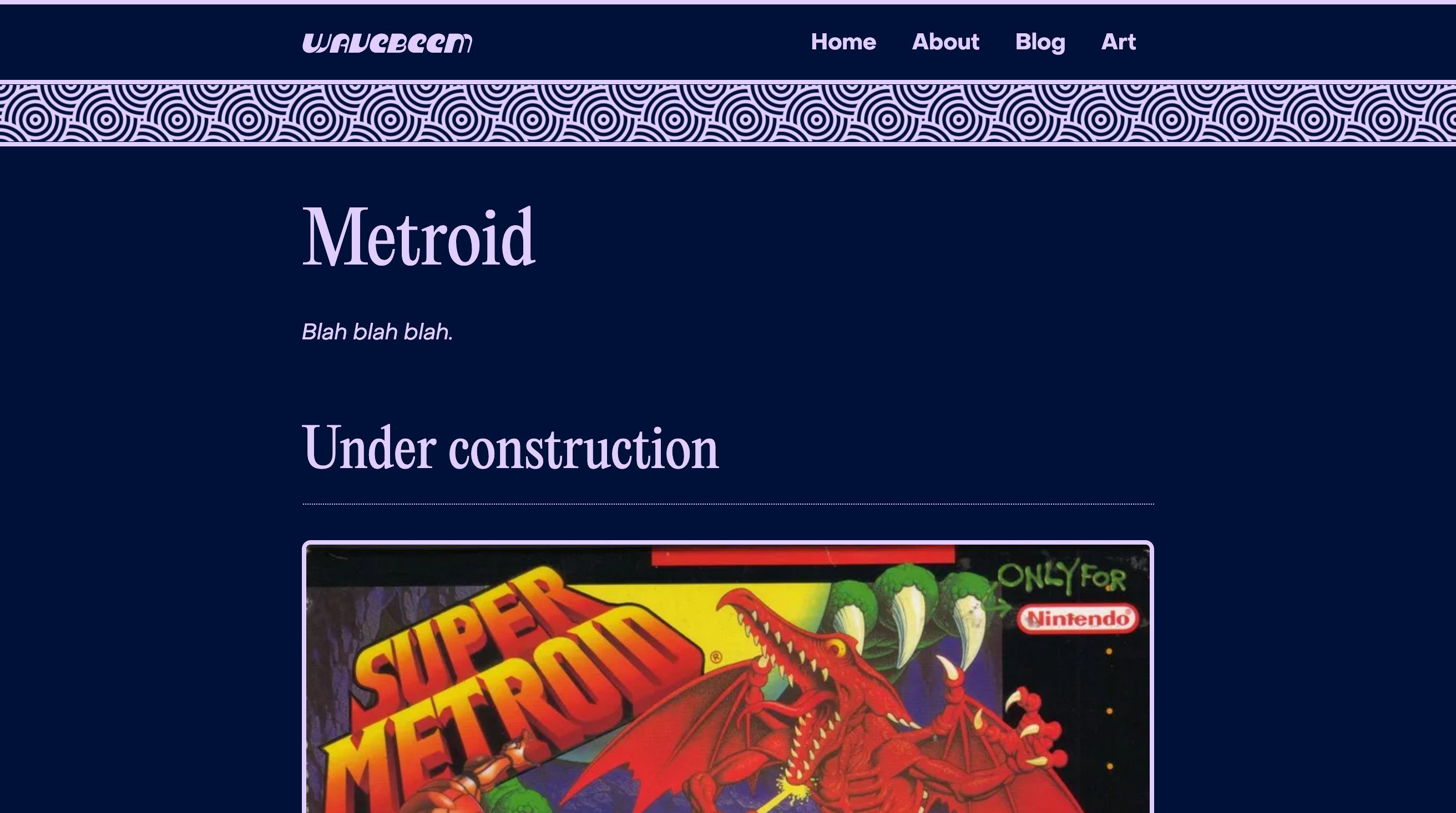
Metroid