wavebeem 2.0: Slime Mode
With cohost.org going away, I decide to lean even harder towards working on my personal website. I've created a new theme, with a softer, more playful aesthetic than ever before. I've also created many new sections on my website.
New style: fun with pastels

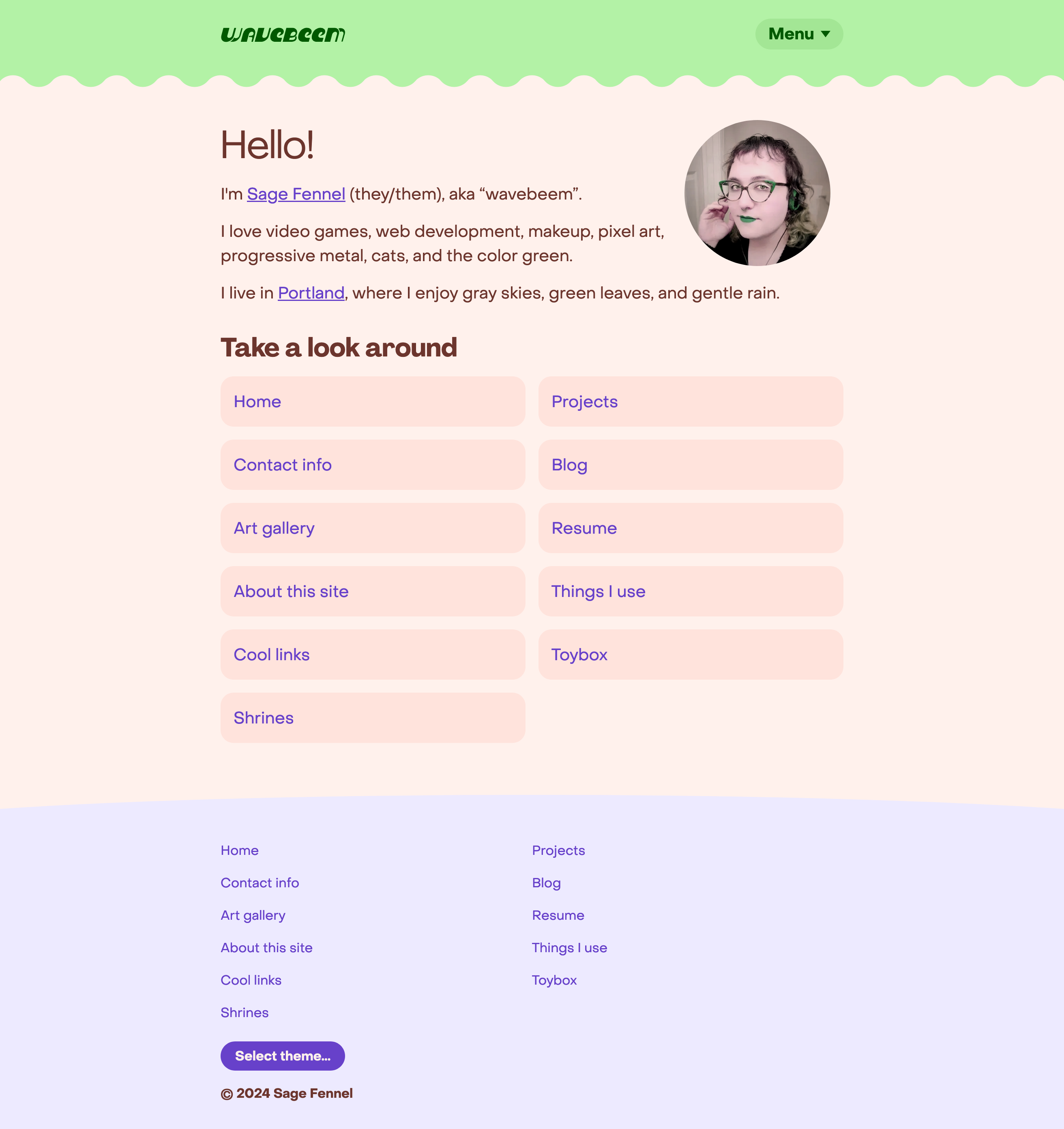
Theme inspiration: playful, pastel, slime.
In my post about 10 years of themes, I left off with “summer theme”. I made the summer theme as an experiment, despite it not quite feeling like the right colors to represent me. It turned out that I really liked having a warm background on the site again. It just feels so inviting!
The missing piece was incorporating green into the page again. The seafoam color was very fun, but it didn’t feel like me.
Dark mode: chocolate factory

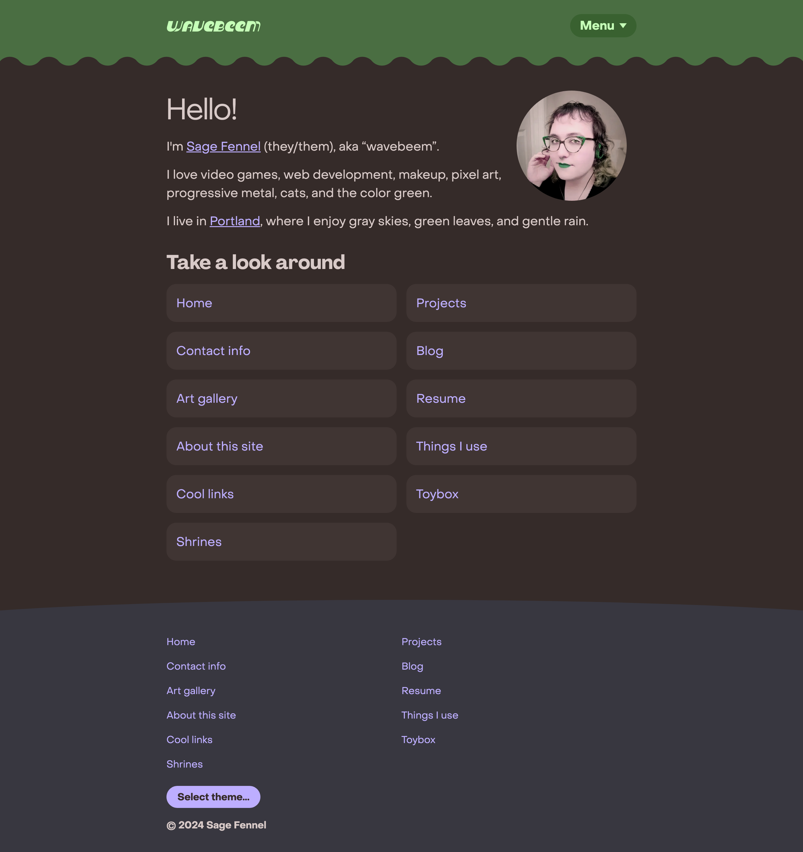
Dark theme inspiration: chocolate, matcha.
I have difficulty reading dark themes in general, but I made one for my site because it’s clear that dark mode is an accessibility feature that countless people enjoy.
Translating my light pastel-based theme to dark mode was quite challenging, but I think I eventually got the hang of it!
Fancy fonts save the day
I have been agonizing over font choice for weeks. Nothing from Google Fonts was giving the precise vibe I wanted. I’ve tried again and again, but serif fonts just don’t feel right on my personal site. I love the elegance of a good serif font, but it’s just wrong for me! The most serif font content I’d consider is just for headings.
My friend Anh suggested the Pangram Pangram® Foundry font starter pack to me. An amazing 52 fonts for only $29 is an absolute steal of a price tag. The only “catch” is that this is a fully non-commercial license. Good enough for me! I’m not making money of this site, and I don’t plan to.
Here’s some quotes from the foundry about these font families:
PP Agrandir
Agrandir is a contemporary serifless type family that celebrates the beauty of being imperfect. It was designed to be a brave antipode to neutral modernist fonts ● Agrandir accepts its own shapes as they are – unaligned, quirky and funky. It celebrates humanity, not machines.
PP Object Sans
Object Sans is a contemporary type family that puts together the best qualities of Swiss neo-grotesks and geometric fonts ● It’s a multifunctional workhorse designed to work best in → any printed and on-screen contexts, including logo design, brand identities, websites, packaging, posters and headlines; regular weight is carefully tuned for small sized body text.
I couldn’t agree more with their descriptions. PP Agrandir is just slightly too fancy for body text for me, but they helpfully suggested a few font pairings on the PP Agrandir page, and I’ve chosen PP Object Sans for now.
Improved blog post navigation

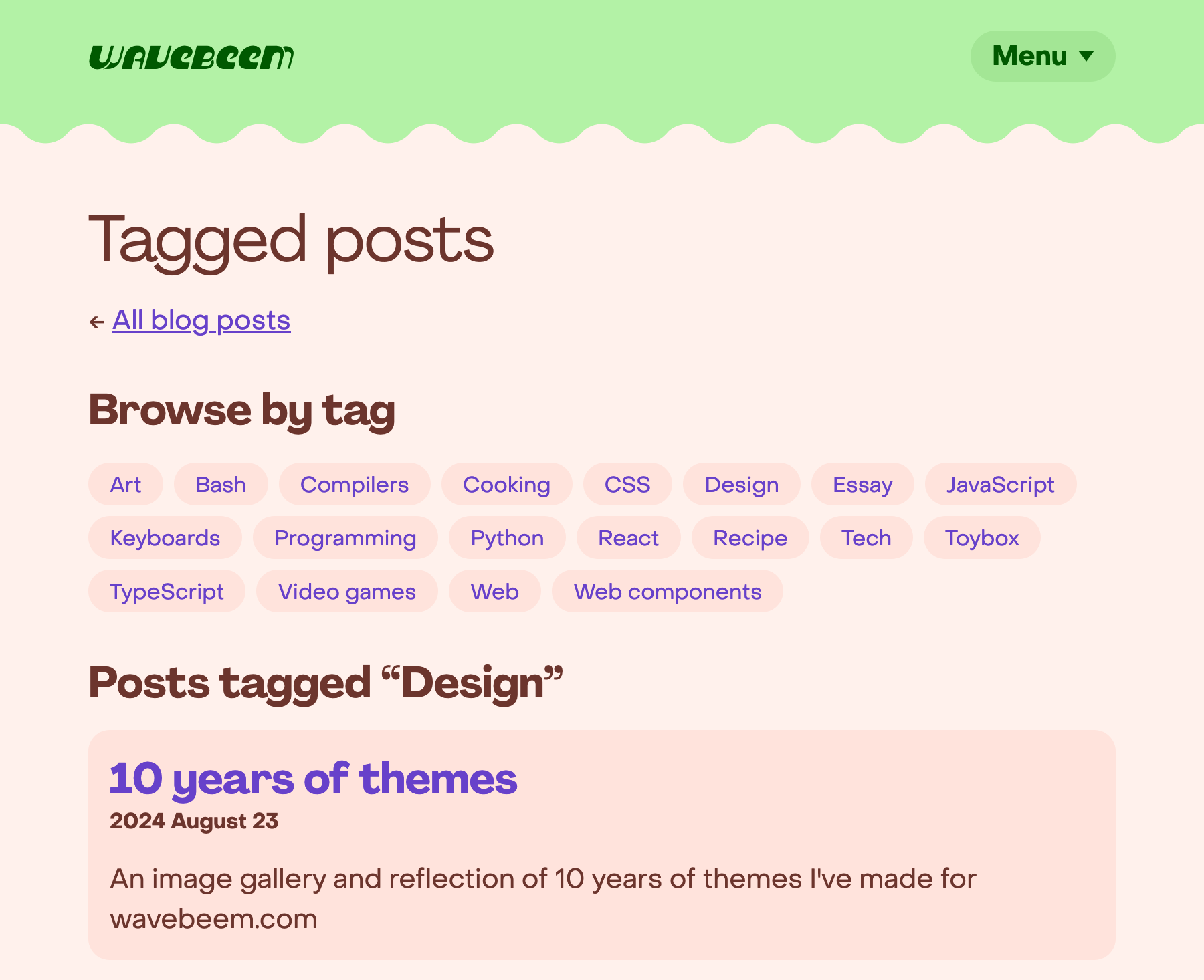
My blog posts filtered by tags.
You can now browse my blog posts by tags. Yay!
Better top level organization
My main page is now more of a hub to the other sections of my site, rather than being jam packed full of content.
There’s a convenient navigation menu at the top (no JS, baby!) as well as all navigation links being included in my fancy new footer.
Both of these locations are resilient to the “too much stuff” problem and will hold lots of links on both mobile and desktop with ease.
Maybe I can chill out
I’m hoping that I’ll stop doing full redesigns of my site so often, haha… I still haven’t made any shrines yet, but I’m planning to unleash my creativity there.
More blog posts coming soon
I have 3 more blog posts currently in draft status. Look forward to those soon (names tentative).
-
10 years of React
-
CSS obfuscation and usertyles
-
Are JavaScript expression statements dangerous?