Tidying up the website again
I took some free time to improve the desktop navigation on my website, and better organize information and links. Enjoy the screenshots.
Holiday vacation
I’m now on vacation until 2 January 2025, so it’s the perfect time to tidy up my site a bit. The biggest thing bothering me was my hamburger menu only navigation. It just felt bad on desktop, so I wanted to change that.
Home page
The hamburger menu just wasn’t cutting it on desktop. It felt really bad to click to show navigation when there’s already so much space available.
So I trimmed down to 6 primary links I can feature in the nav, regardless of mobile or desktop. Any further links are listed in the home page and the footer of every page.
I’m trying to remind myself that pages can link to other pages, and that just giving people a massive list of information can be overwhelming.
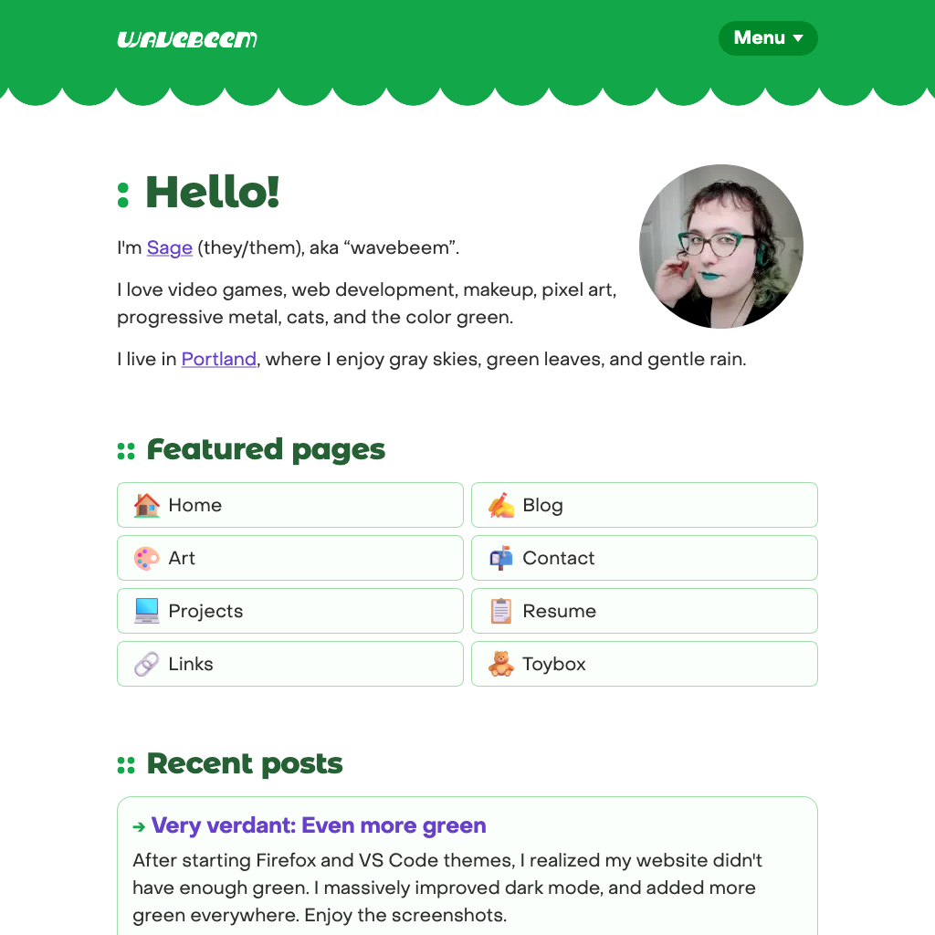
Home (Before)
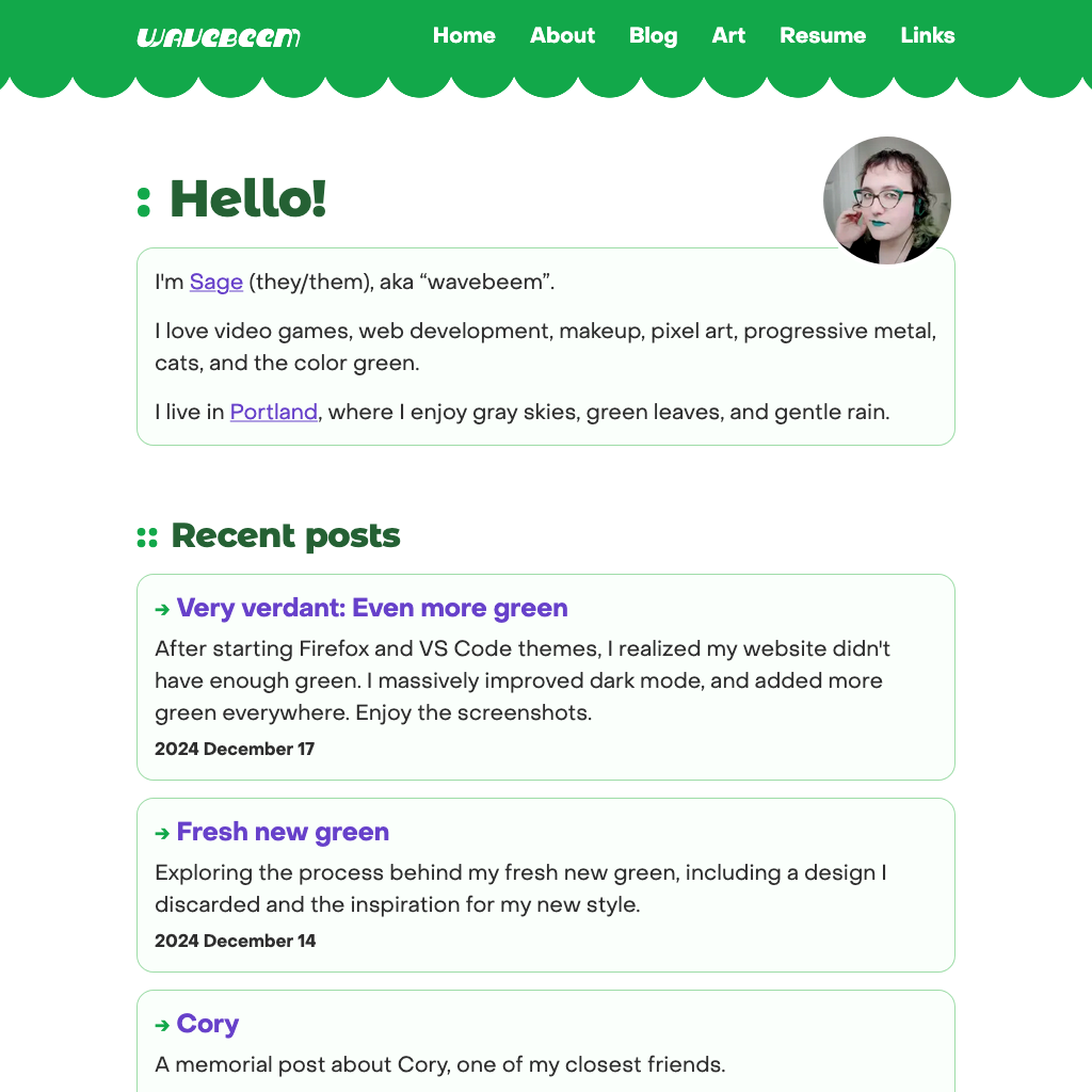
Home (After)
I also reorganized “Recent posts” to be above the home page links section, because the top nav bar should already accomplish the most important navigational tasks. And I want people to see what I’ve been blogging without scrolling too much.
You’ll also notice the selfie is a lot smaller now. It felt like it was dominating the page before, rather than augmenting it. I also aligned the selfie so that my eyes line up with the heading, rather than the top of the circle. It feels a lot more visually balanced to me. To compensate for the smaller size, I increased the scale on hover when playing with the secret easter egg holofoil effect.
Links page
End of an era with 88x31 site buttons. I’m still keeping mine listed on the bottom of this page, for folks who want to use it. But I’m tired of using other peoples site buttons. I think it unfairly privileges the few sites that actually have them. And I want to start organizing this page based on topics, rather than “has button” / “doesn’t have button”.
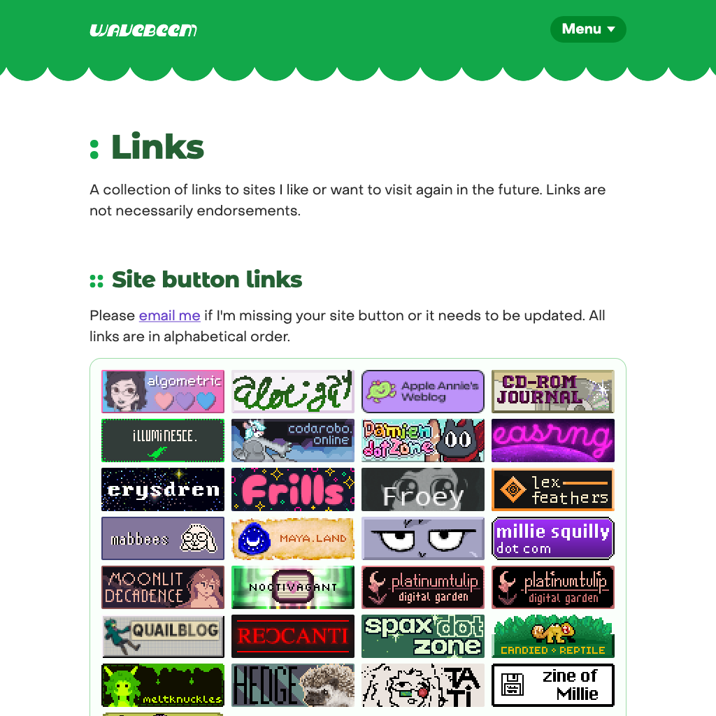
Links (Before)
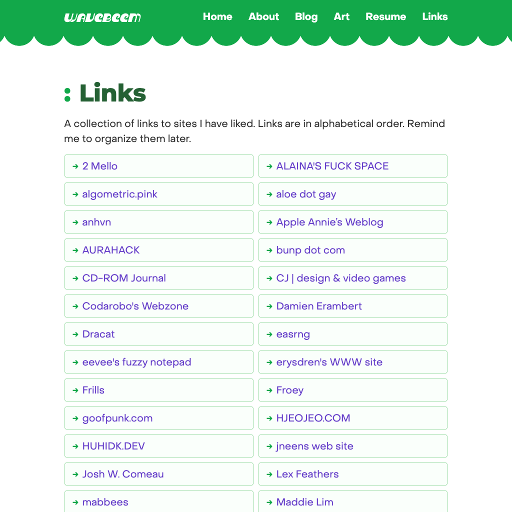
Links (After)
In order to make up for the page being a bit boring otherwise, I’m leaning on the link accent color and the decorative green arrow all over the site as my “you can click this” signifier. It might be heavy handed, but it’s part usability and part decoration. I enjoy it.
Projects page
This was just a long overdue update. Making the section headers clickable let me shorten the descriptions of each card. It looks prettier now due to the link treatments I’m using all over the site, and it should be easier to browse.
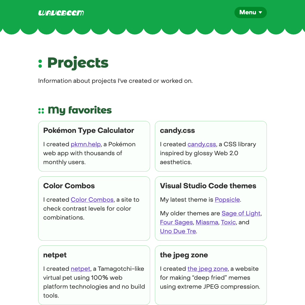
Projects (Before)
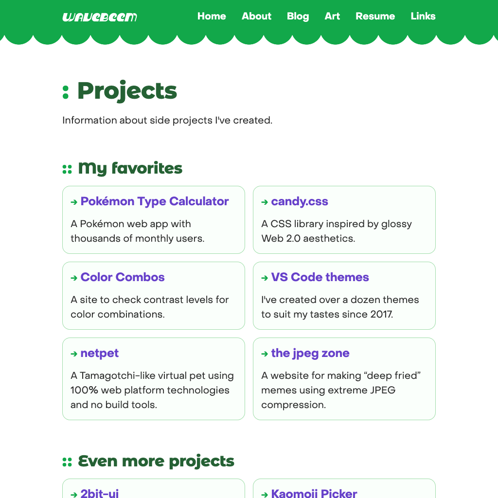
Projects (After)
About page
I want to feature the about page strongly now. I’m going to add more info about myself there, and use it as a jumping off point for other pages about me that I want to keep up to date (e.g. projects, contact info, things I use). There’s simply not enough info in the top nav for all of these things.