Getting weirder with fonts, and: too much of a good thing
PP Talisman from Pangram Pangram Foundry is my new heading font—or “cool font” as I'm calling it in the code. But I'm trying not to overuse it!
PP Talisman
My new “heading” font, or “cool” font as I’m calling it in the code, is PP Talisman. It feels like it could be a sibling of Ultra Hi-Gloss (my logo font).
I will quickly create JS generators
I will quickly create JS generators
As much as I love PP Agrandir, it wasn’t different enough from my body text.
I needed more quirkiness
I realized that the quirky flavor of my page felt a little bit lost during my longer blog posts. I don’t want to change those, so I figured I needed to lean in harder with a funky font!
“Blog” page
I decided to make my <h3> tags bold and italic just to shake things up a bit.
Given that the <h2> and <h3> aren’t that different in font size, I wanted
them to be easier to tell apart from each other.
I specifically decided not to use my “cool” font for <h3> because the page
felt “over-seasoned” with that much quirky font back to back lol.
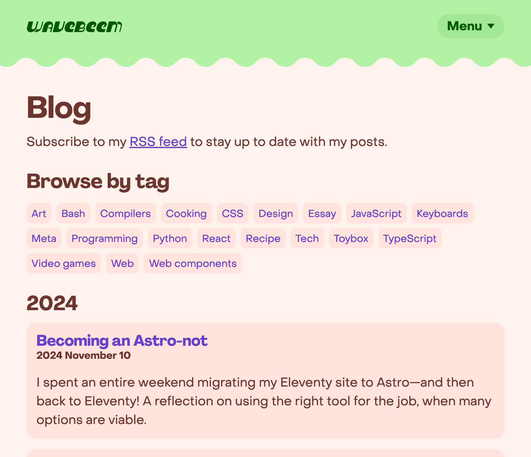
Before
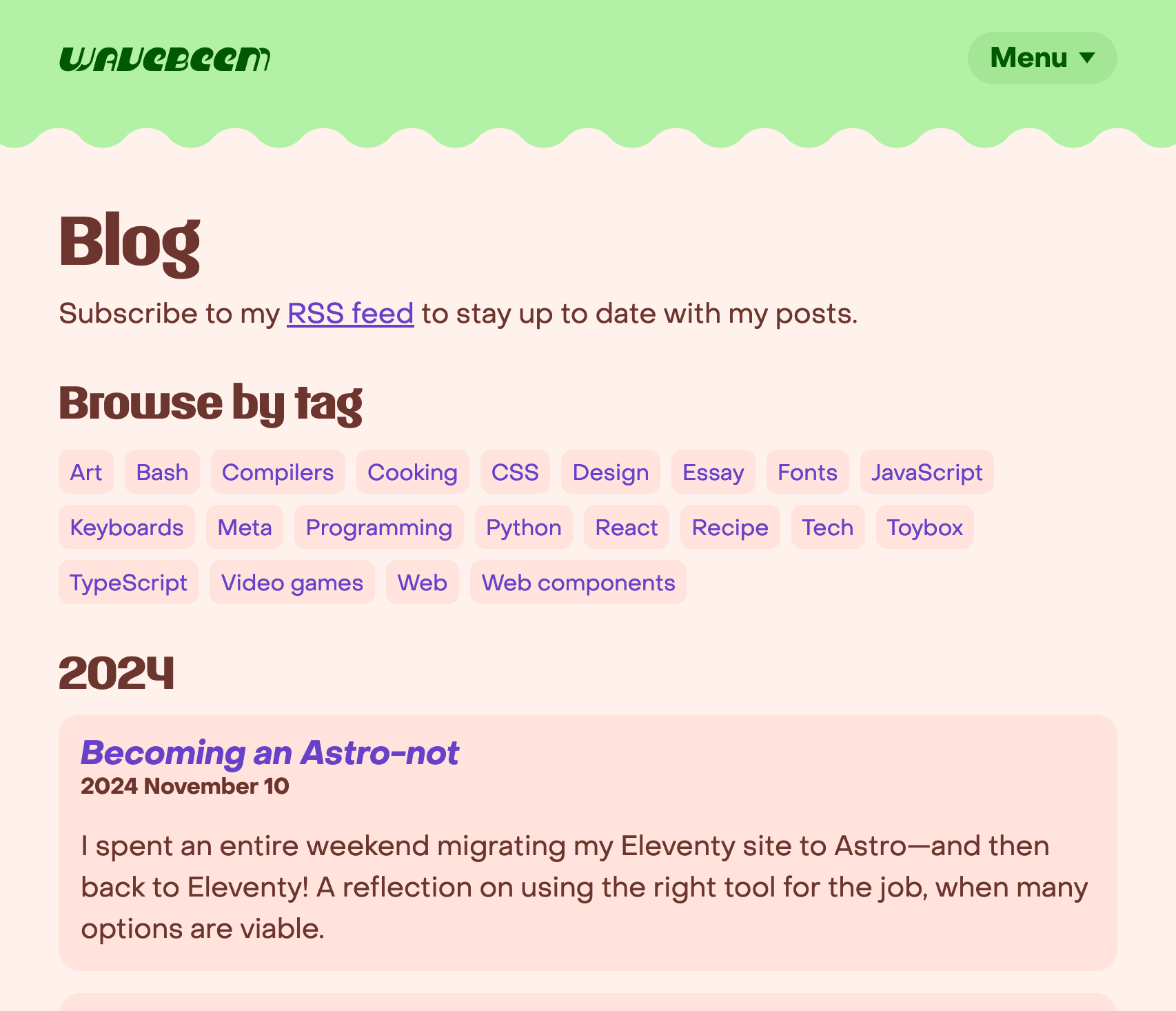
After
“Infobox”
Not exactly a font thing, but the colored background for my “infoboxes” has been bothering me for a while. I love the color for my footer, but it feels out of place in the middle of the page. Also, it’s a color that decreases the contrast of the foreground, which I’m not in love with. I like dotted borders a lot, and this felt like a really natural place to use them again.
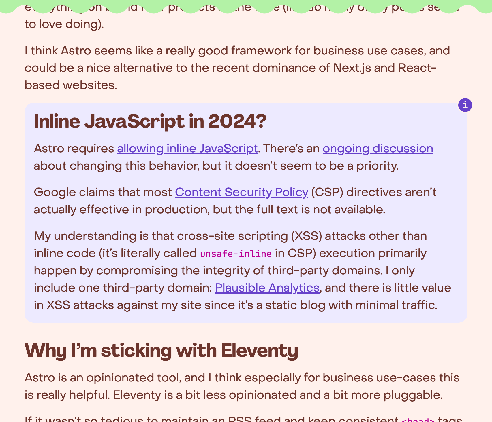
Before
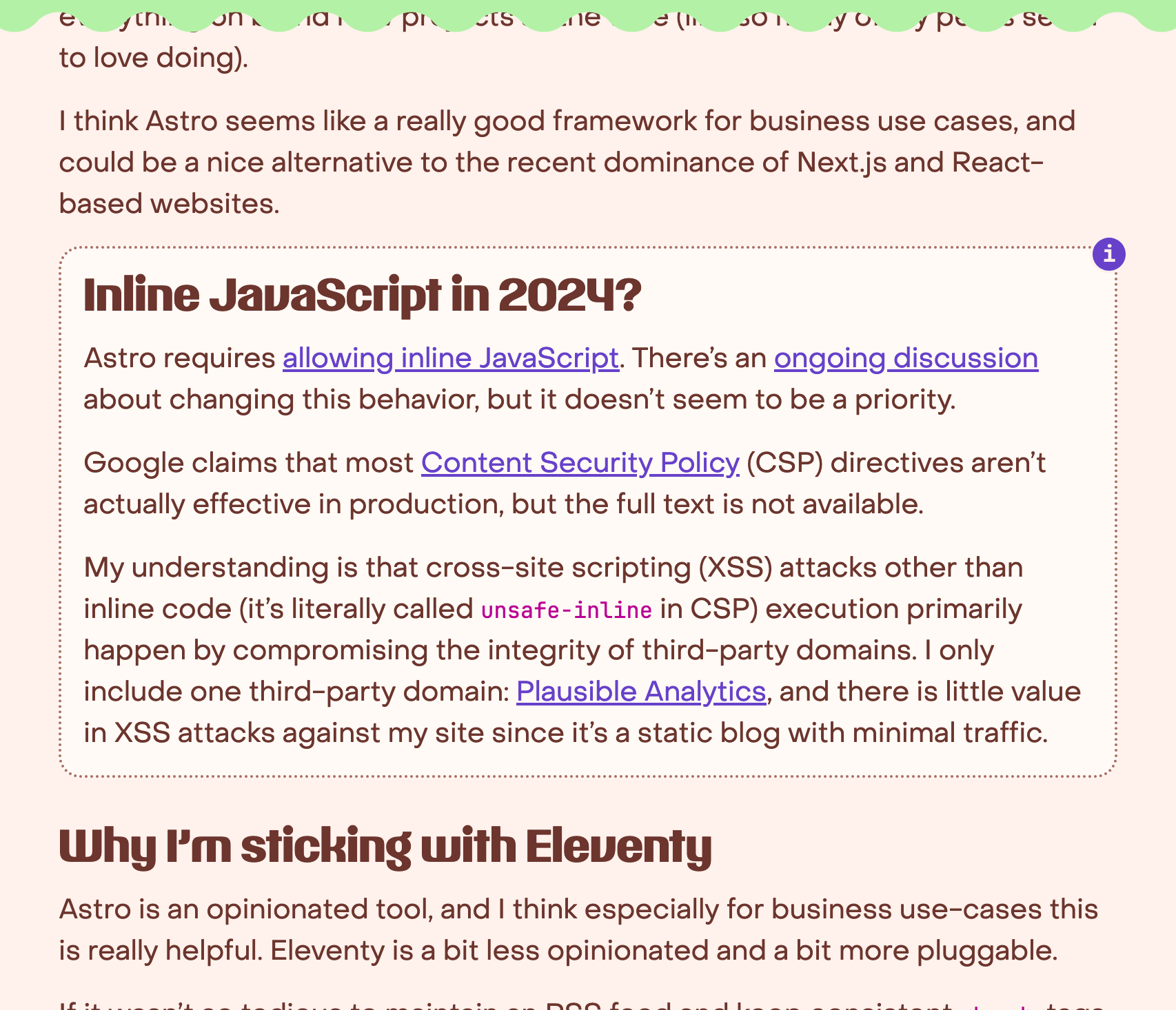
After
“Projects” page
The repeated bold headers with the same font felt completely overwhelming no
this page. Switching up the <h3> font and using italic text (well,
oblique, really), helped break up the monotony.
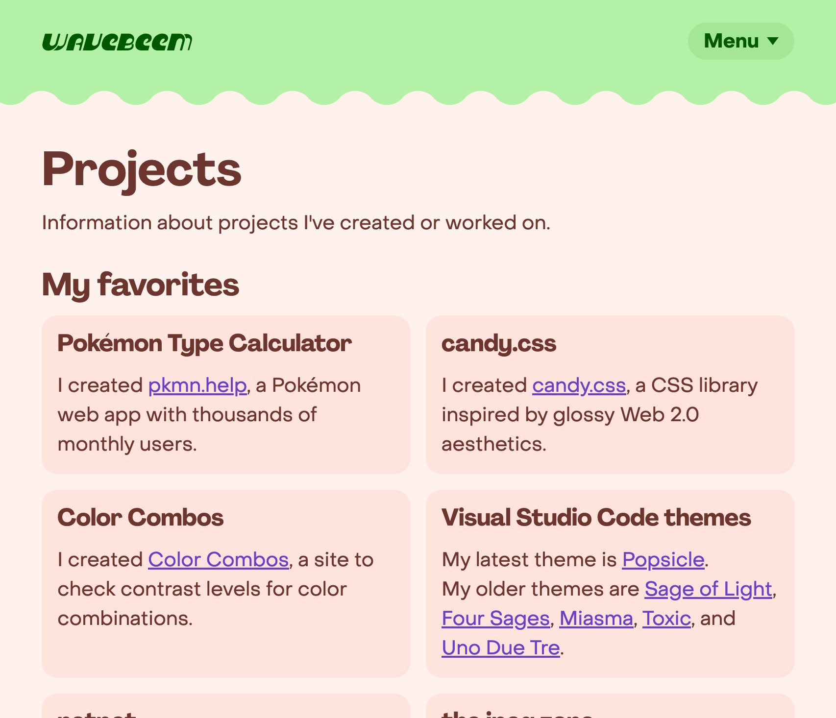
Before
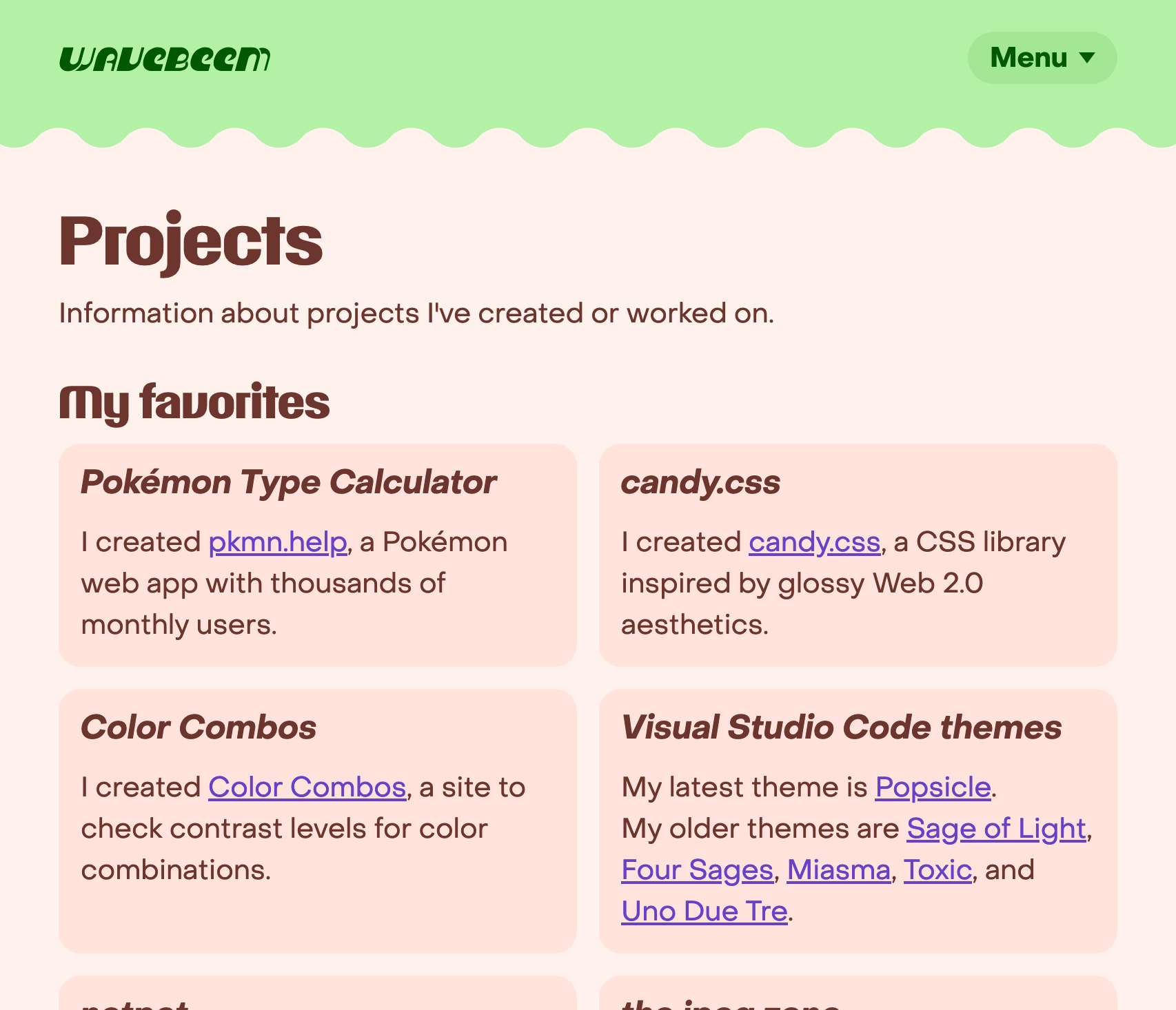
After
“Things I use” page
The repetitive headers felt the worst on this page since almost everything was using my “cool” font (PP Agrandir, at the time), which was making it feel boring instead.
Apparently the <summary> element is seen as a button by default to assistive
technologies, so the <h3> tags were being downgraded to plain text anyways…
so for this one I just changed to using the <i> tag.
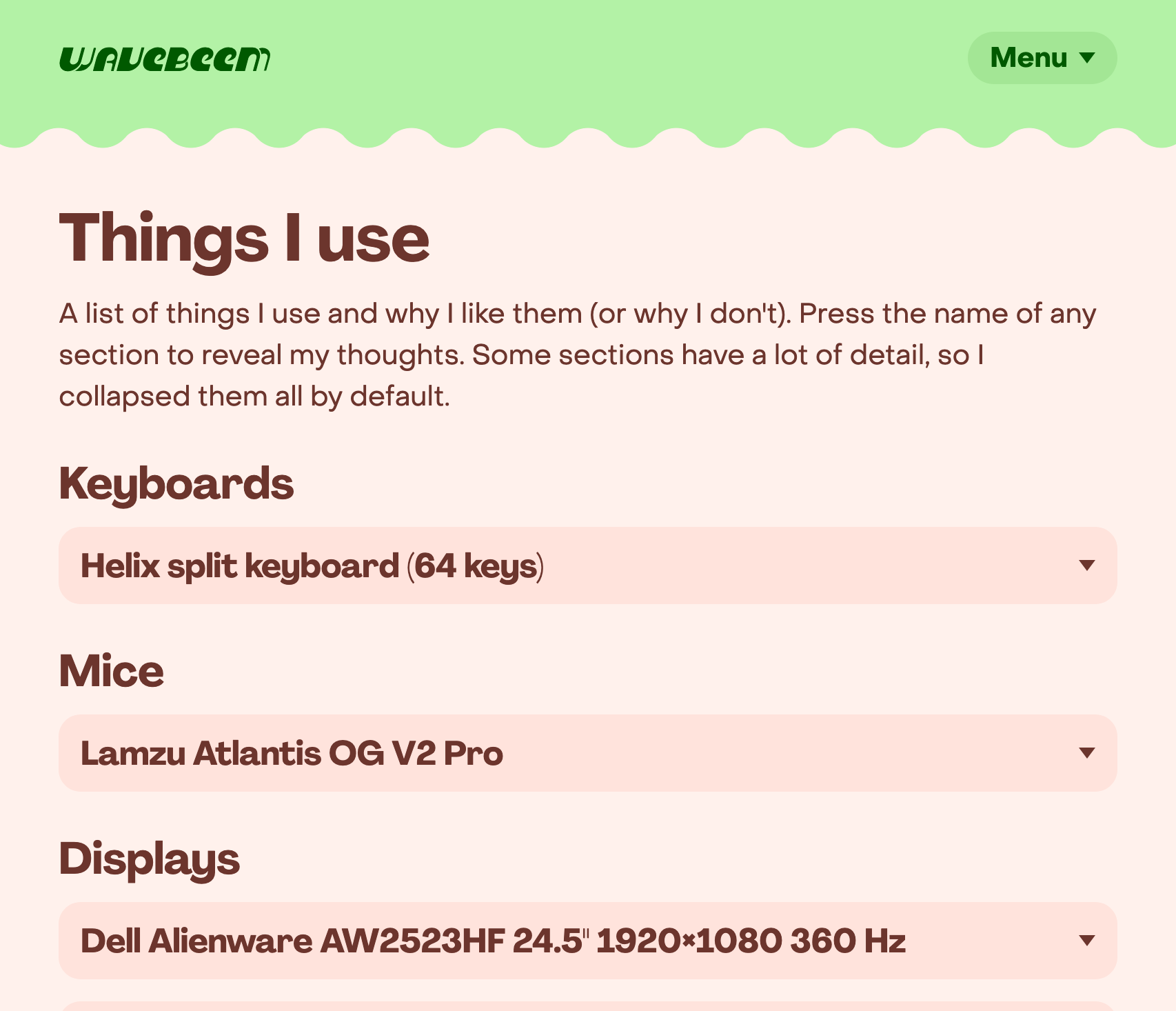
Before
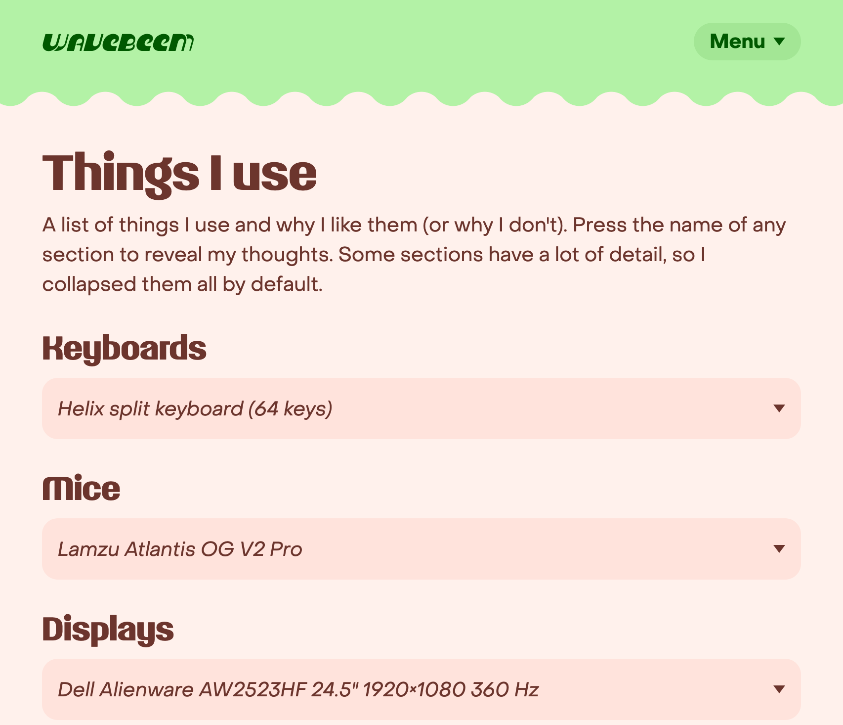
After
I’m having fun
And what’s what matters. I hope you like the new font and other design tweaks too :) Let me know what you think.