10 years of themes
An image gallery and reflection of 10 years of themes I've made for wavebeem.com
Let’s take a tour through the last 10 years of themes for this site.
Note: Older screenshots have been altered to cover up “legacy” images, names, and pronouns.
2013
Based on the copyright footer, I already had this website since 2010. It was my my first website at a domain I owned and operated. I think it was hosted via GitHub pages. It was made as plain HTML files :) I clearly hadn’t heard of the concept of “line height” yet, and it looks a little barren. It’s really just a resume, but it almost looks like technical documentation for an uninteresting library. This establishes my love for green and my desire to have something a little softer than stark white.
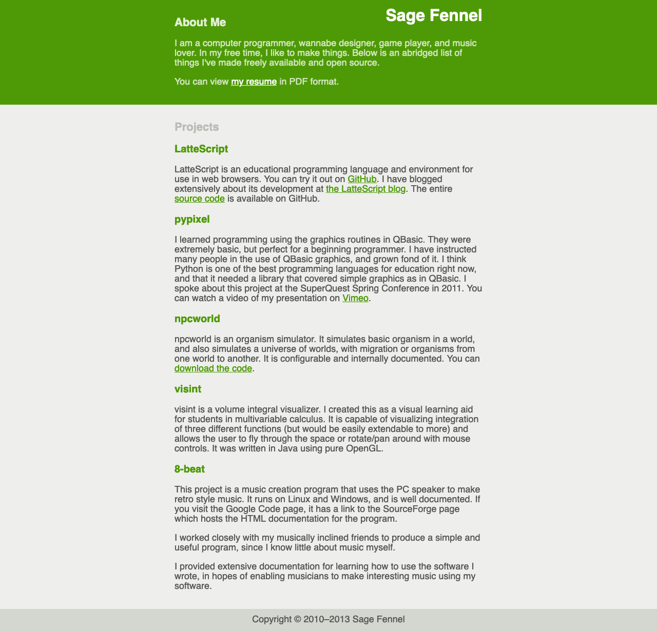
Basic resume—with two background colors
2014
Welp, I used Bootstrap lol xD Everyone else as at the time, and I probably did this because I thought it would be good practice or something? Honestly it looks pretty good even by today’s standards, in my opinion. The bluer green looks a lot nicer, there’s a photo to welcome you and humanize me, and I put contact info front and center. It’s a bit dense with all the sections of text and relying just on heading sizes to differentiate everything, but I was trying!
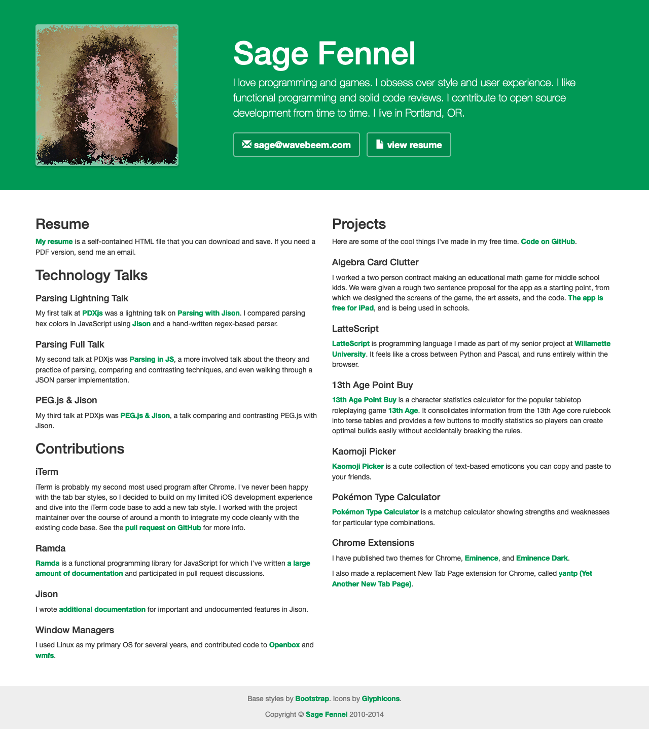
Bootstrap—It looks like a lot of other sites from this era
2015
I think at this point I switched back to fully custom CSS. This was released the
year after Material Design came out, so you can see I was clearly inspired by
flatness and cards. I guess I wasn’t interested in using CSS box-shadow, which
was definitely supported in every browser
at the time. The layout is giving a
masonry layout
vibe, which was probably already a big deal on Pinterest or something at the
time.
The green has shifted even bluer—maybe too blue.
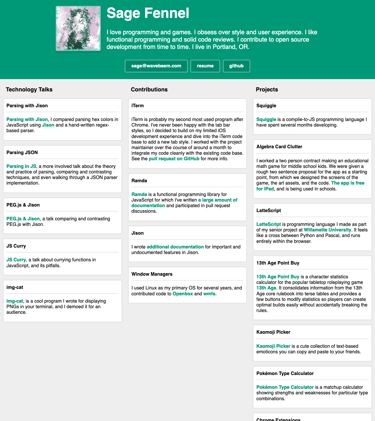
Cards—It’s all about cards now
2016
Wow, did the “mobile first” bug bite me here? The 2015 layout was a bit overwhelming and dense, but this layout feels incredibly silly and sparse on desktop! Looks like I tried to bring serif fonts back for a minute, but it’s just so weirdly columnar.
The green looks really nice in this image to me.
Mobile first—a simple landing page
2017
Whoa, I guess I was thinking about Material Design again with the ALL CAPS and underlined tab bar on top of stark white. It kinda looks like a mobile app. It’s clean, but it’s lacking a bit of personality. Clearly I tried to inject some with the “chat bubble” interface at the top and my fun pixel art self portrait. I like that I put more content on here and it’s more conversational, but it just doesn’t have enough color for me.
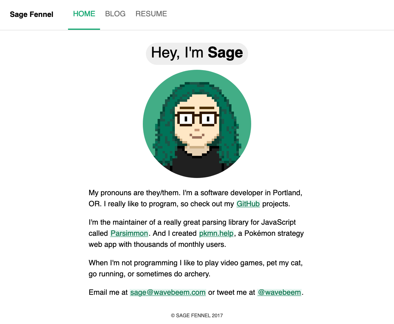
Material design—and a pixel art self portrait
2018
Not a huge shift, honestly. I got over the Material Design nonsense and injected some color back into the page. The massive commissioned portrait is fun! And I’m sure I was proud of the speech bubble arrow at the time haha.
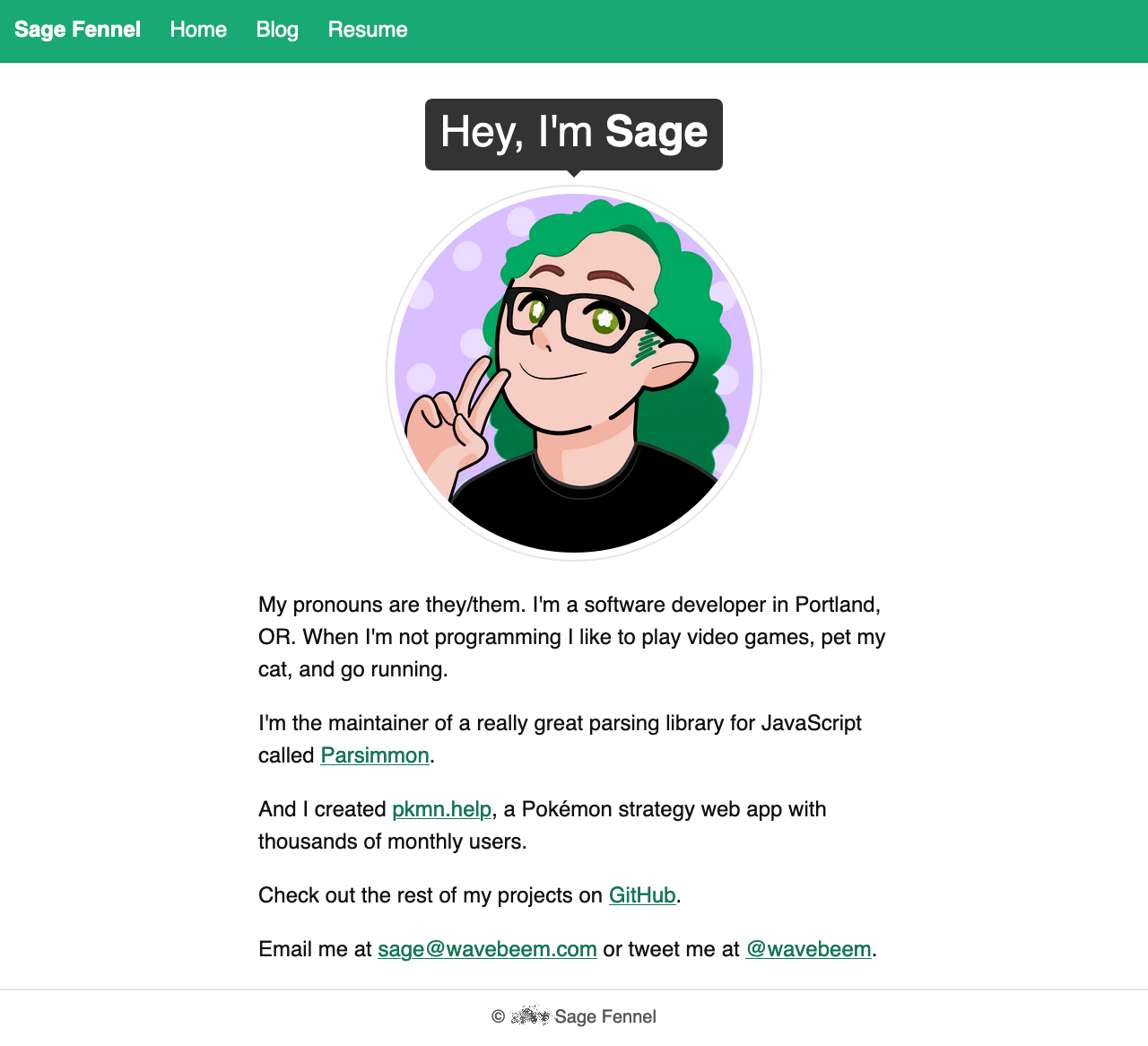
More green—plus a commissioned portrait
2020
I’m not sure what happened in 2019, maybe I was too busy to update how my site looked? Maybe I missed a theme update in my Git history when I was browsing it. Well, we all know what happened in 2020 that made people spend a lot more time on the computer, but it looks like I made this new theme back in January before the US was taking any COVID-19 precautions.
Sadly, green is almost entirely absent from this theme. It looks cool, though. I wish it was my own art, but my recolored Dragon Quest slime was animated and made the page feel lively. I went hard on serif fonts here, but I think it works really well given the parchment colors and adventure vibes on the front page. Also I implemented a reactive pixel art container using CSS which I was super proud of. This was also my first site to include a dark mode! I had previously been a massive dark mode nerd when I used Linux, especially while I was in college, so the whole dark mode trend felt kinda like “well duh” to me at the time. Fast forward to 2024 when I find them painful to look at on average, probably in part due to my astigmatism causing light text on a dark background to look blurry.
So in many ways this feels more me, but like I lost something.
EN4 color palette—animated Dragon Quest Slime & old timey parchment vibe
2021
You can see 2021’s design swinging hard back to 2018 with the color palette and nav bar especially. This time I made a much cooler self portrait, one that I’m still proud of honestly. You’ll notice it’s got a nonbinary flag in the background: this was the year I came out as nonbinary :3
The colors are a bit more relaxed here, and it’s (barely) using my 1bit-ui library.
Cards again—Another self portrait
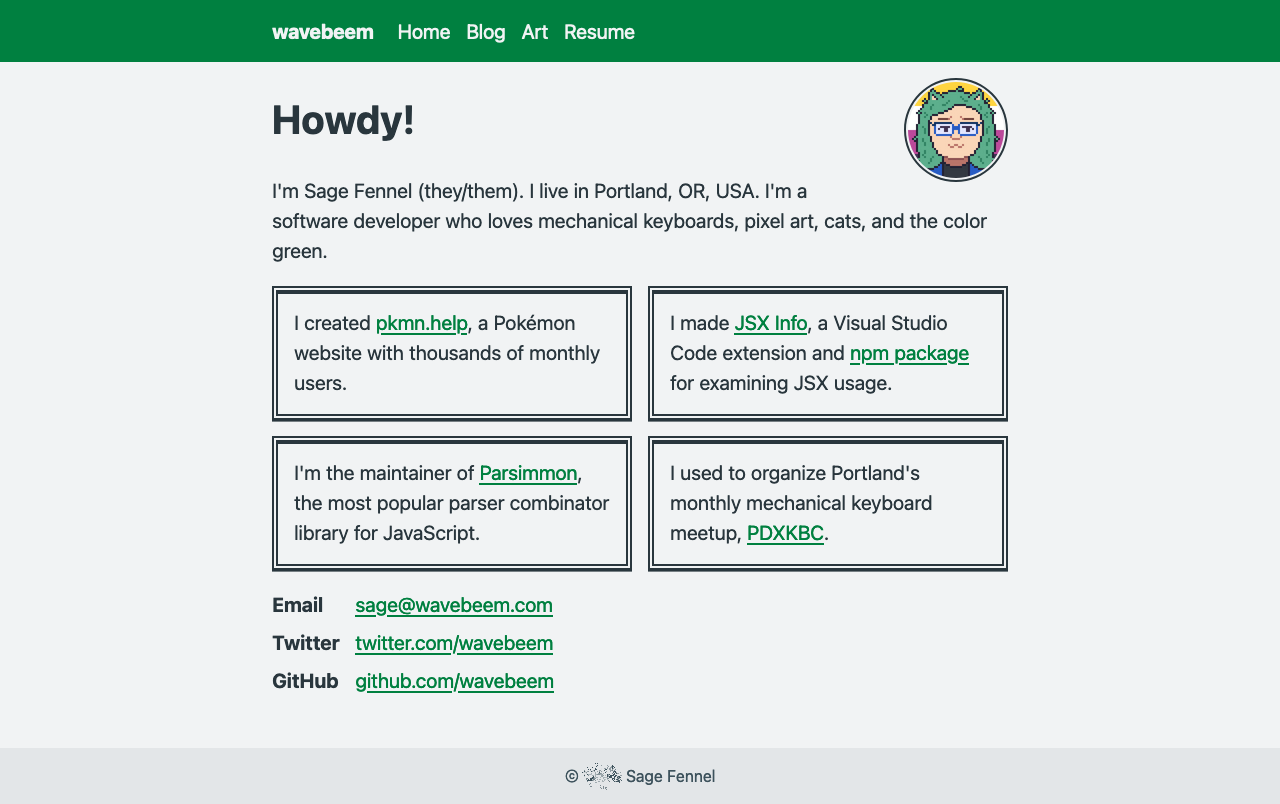
2022
Minty fresh! Pink still isn’t a fave color for me but it works really well here. I miss having a contrasting nav bar, and the 2bit-ui usage makes it feel a bit drab with so few overall colors, but this one is finally oozing some personality.
Mint green & pink—plus it uses 2bit-ui
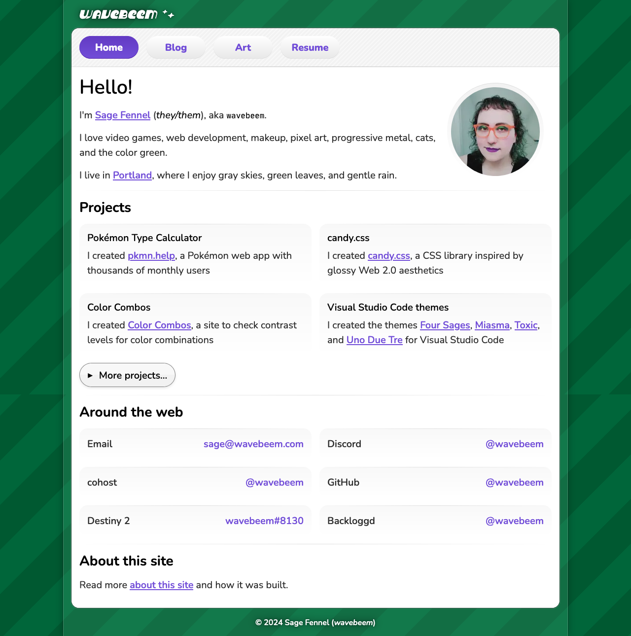
2023
This rich purple background feels so cool to me still! I made it specifically to make the neon green pop. You can see from my neon green hair that I was starting to play with my personal aesthetic too.
The switch to dark mode let the colors be a bit more fun, and I made the nav bar stand out just a bit.
My favorite part is the new logo font! It’s Ultra Hi-Gloss by Froyo Tam.
Dark purple and lime—and my matching hair!
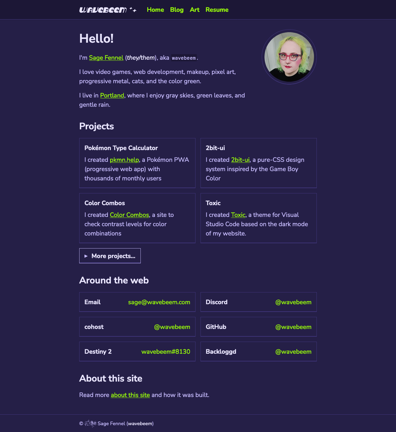
2024 part 1
Eventually I made my third CSS UI library, candy.css. I felt inspired to update my home page to use it.
The color scheme is actually inspired by a Destiny 2 shader from Gambit, the game mode run by everyone’s favorite weird uncle, The Drifter (voice by the lovely Todd Haberkorn).
I love the idea of this page. The textures feel super cool, and I love all the greens. But the lime green barely stands out against an all green background. And my least favorite part is that it’s just so boxed in. The concave cards look really cool, but having the whole page in a little container like that honestly feels suffocating!
Dark green and lime—featuring my candy.css library
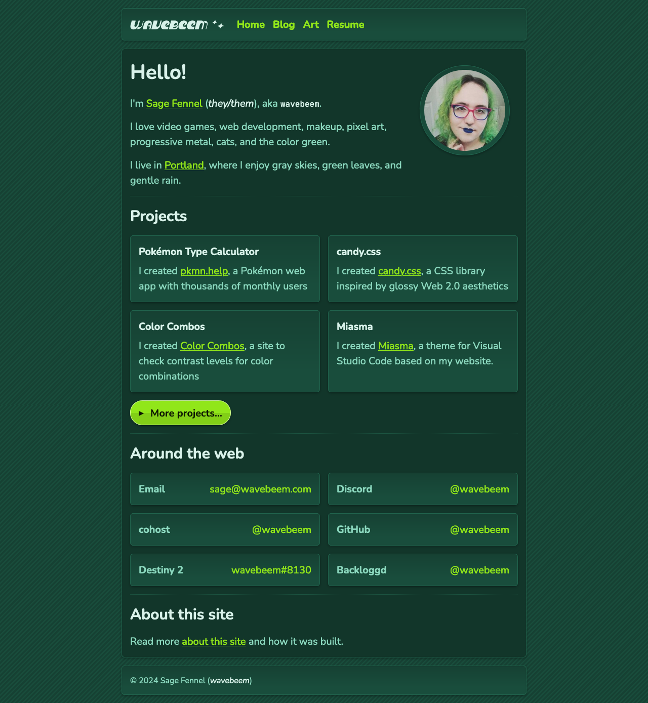
2024 part 2
I came up with a fun new “card” style to make the content less boxy, but I doubled down on page boxes by putting everything in a literal Windows Vista-style frame. It looked really cool, at least on desktop. But the stark white mixed with gray was really killing the vibe for me.
The nav bar kinda made me feel like the Wii UI just a little bit, which even though I never owned a Wii, is quite nostalgic to me.
Windows Vista meets Nintendo Wii
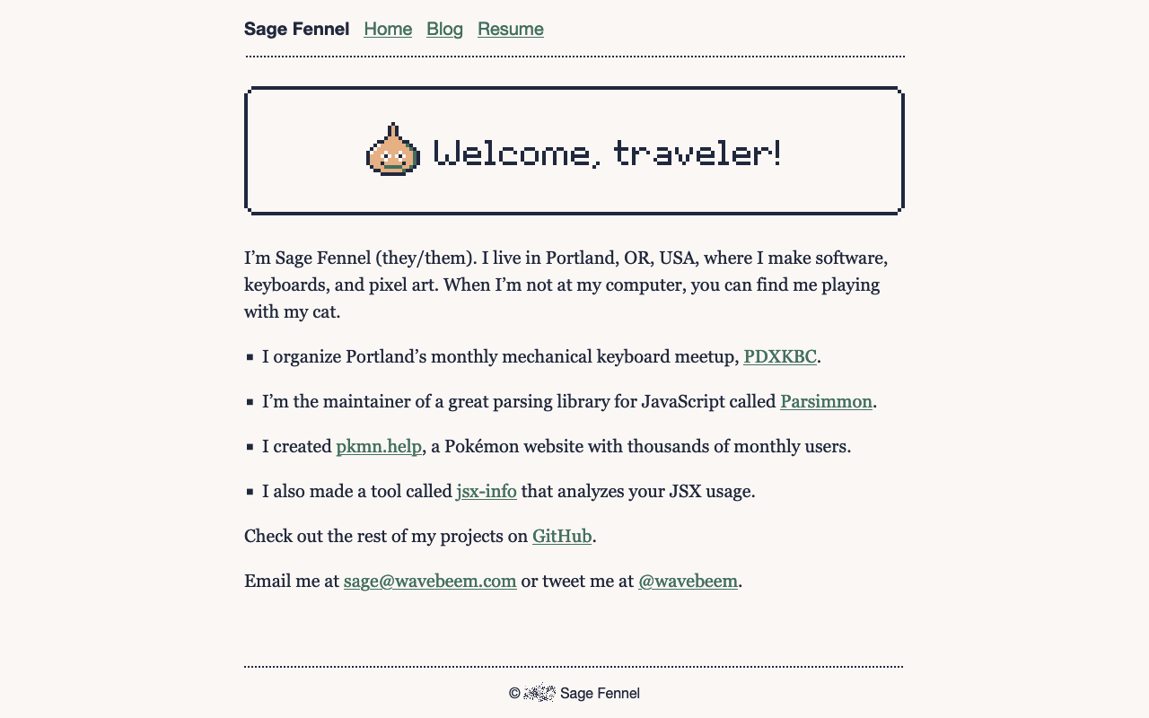
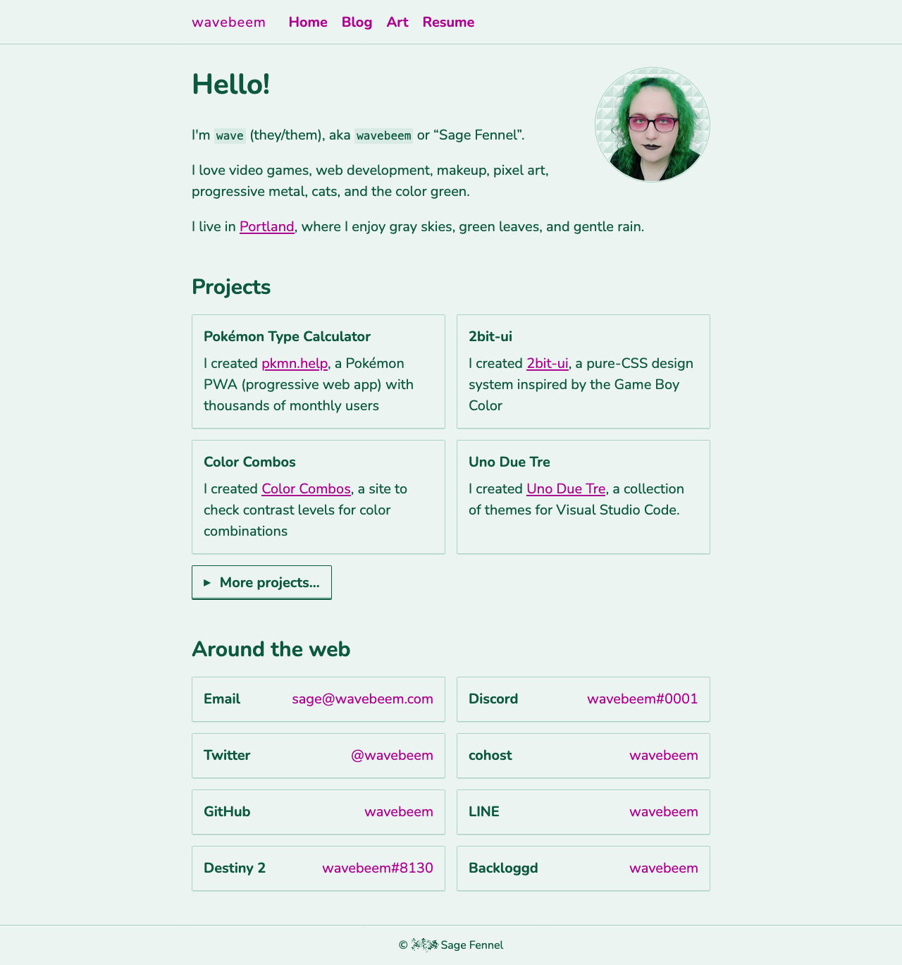
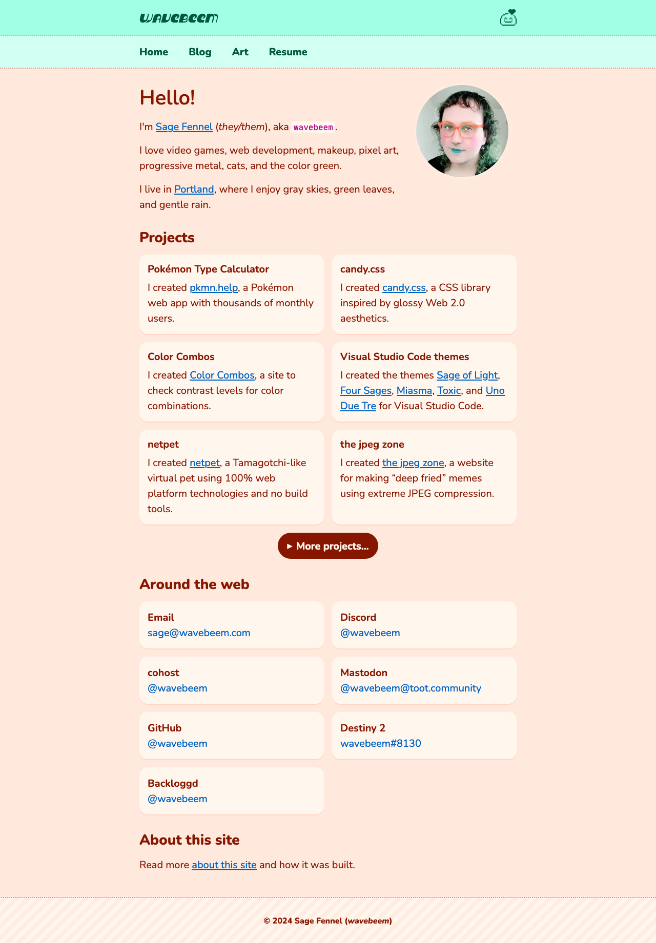
2024 part 3
By this point I was feeling absolutely crushed under the weight of multiple years of using my own CSS libraries for my personal site. The whole point of me making CSS libraries for myself (besides CSS practice), was so that I could use them for making smaller sites where I didn’t want to get bogged down making a bunch of UI styles. They still serve that purpose very well. But for my main site I wanted full creative control to experiment again.
My concept was “lime & lavender sorbet”, with the footer conjuring images of a cute cafe’s paper straw. The soft, pillowy cards, the edge-to-edge content, the thick dotted lines, they’re all trying to make the site feel comfy. And then I added my netpet link with the animated image of netpet itself as a fun decoration to the site.
I’m still really proud of this design, though I’ve tweaked it since.
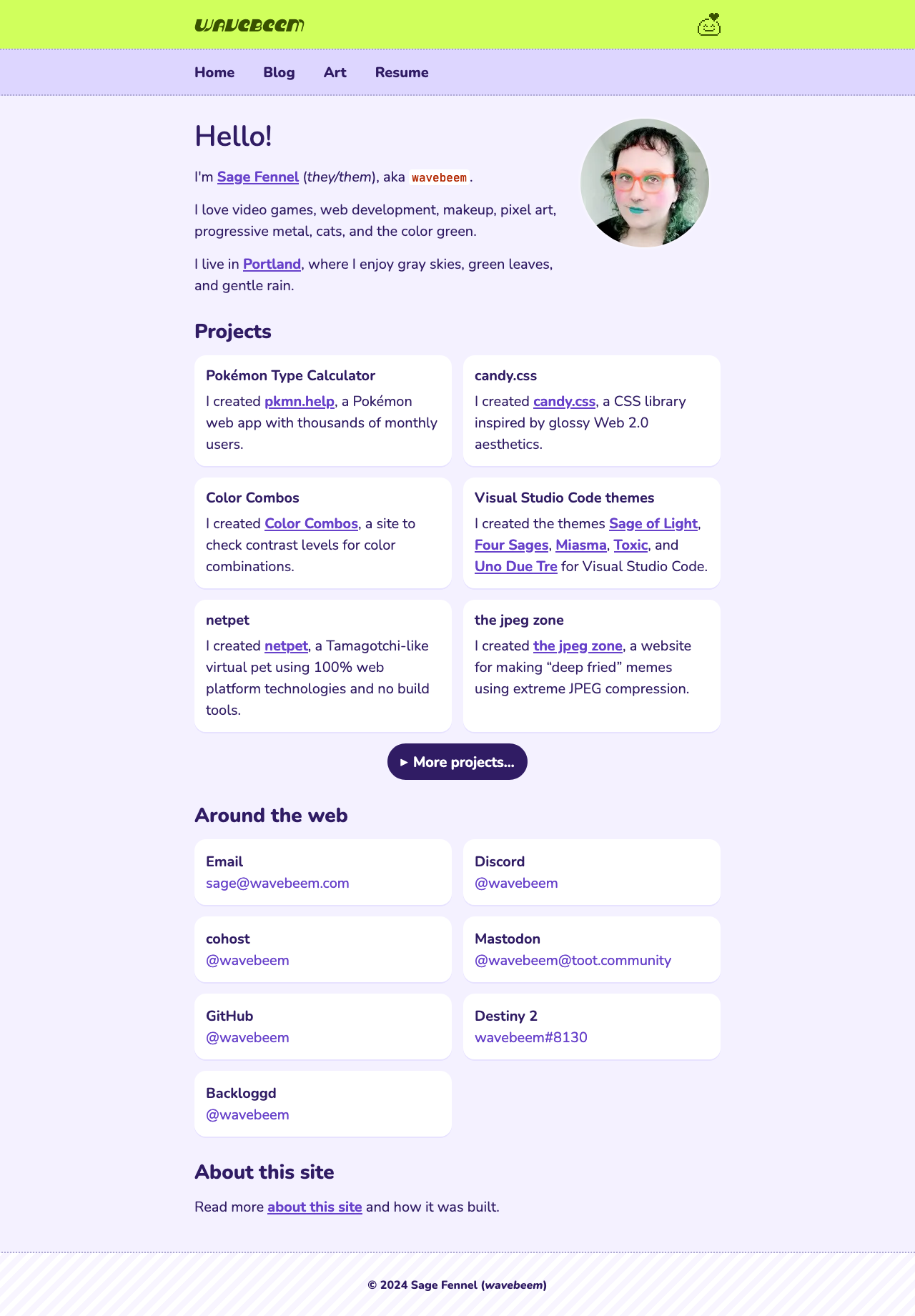
Lavender and lime—fully custom CSS again
2024 part 4
I’ve been struggling with chronic health issues for the past 9-12 months or so, including sinus problems and migraines. As part of my treatment, I’m attempting to limit the amount of blue light I shine at my eyes. So I’ve been working on screens with “night light” (orange tint) active. As such, I’m now gravitating towards themes that are orange, because they match well with the already orange tint.
Coupled with it being Summer right now, I’ve just been thinking about Summer vibes. Believe it or not, I was hugely into going to the beach as a kid, so I have very fond memories of the beach. Granted this theme is more tropical beach than Oregon Coast, but I wanted to capture the feeling of summer. Maybe I’ll do more seasonal themes later? Or maybe I’ll just keep 24/7 summer online. Hopefully it makes people smile.
The one thing I’ve struggled with is the dotted borders at the top. I think they look ok at best. I like the one on the bottom of the page since it helps cut off the striped background nicely, but I’m not 100% sure what to do at the top.
I want to play around with adding some kind of stepped gradient effect at some point, or maybe add a bit more depth to the page. I definitely don’t want to go full neumorphism or anything, but I love a good subtle shadow in a UI :)
Summer theme